Kitchen Meditations
Some people use cooking as a form of meditation. The methodical act of creating, measuring, and mixing eliminates distractions and soothes the mind. A kitchen in Central New York demonstrates what that sense of calm and serenity looks like when applied to aesthetics and functionality of design.
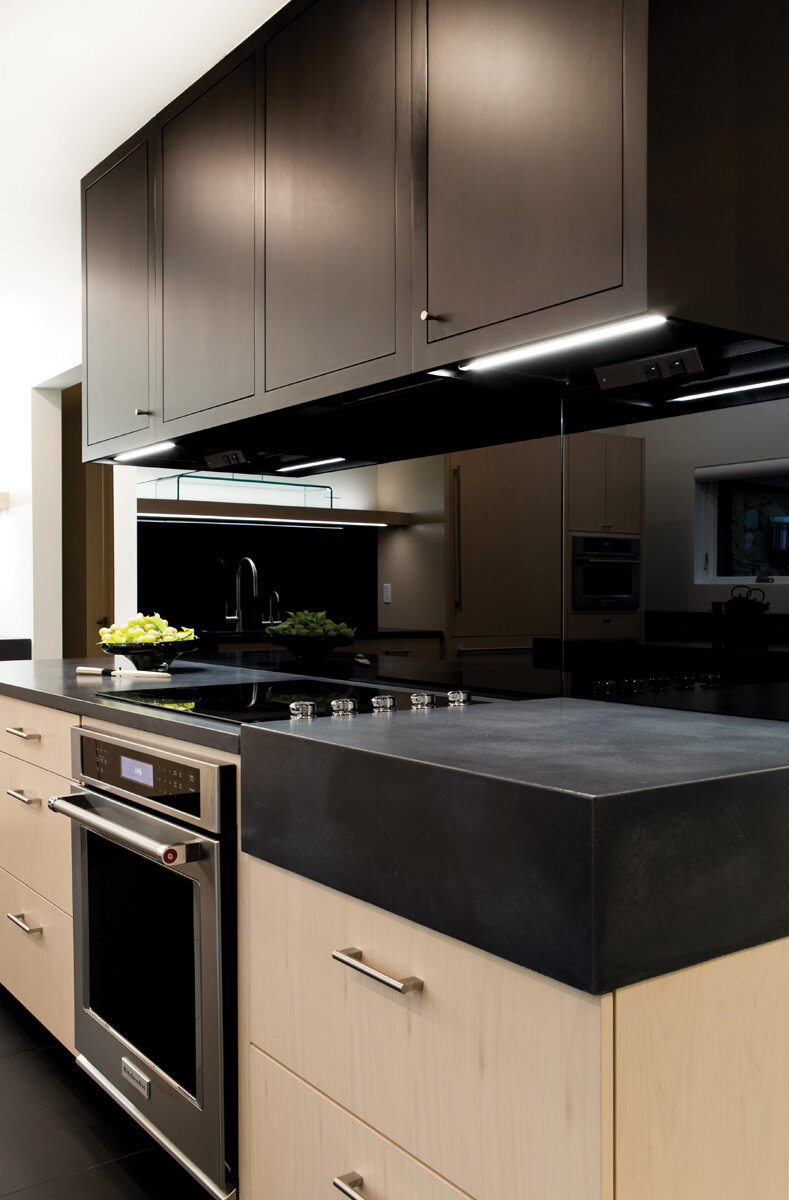
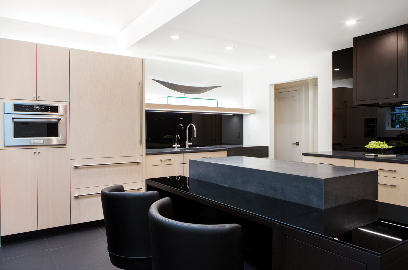
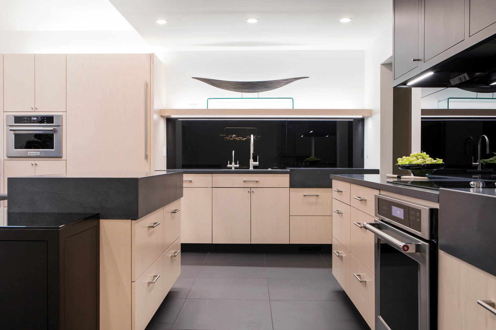
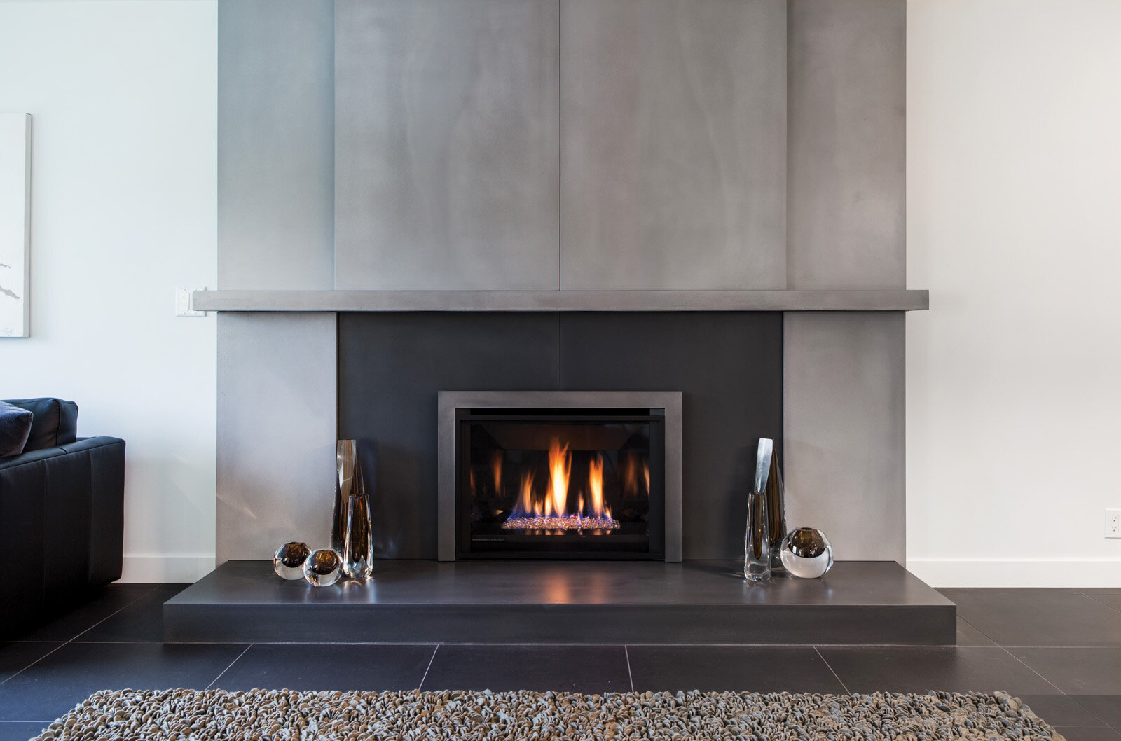
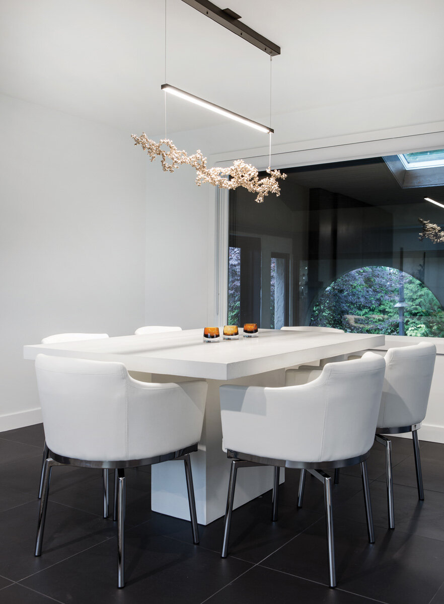
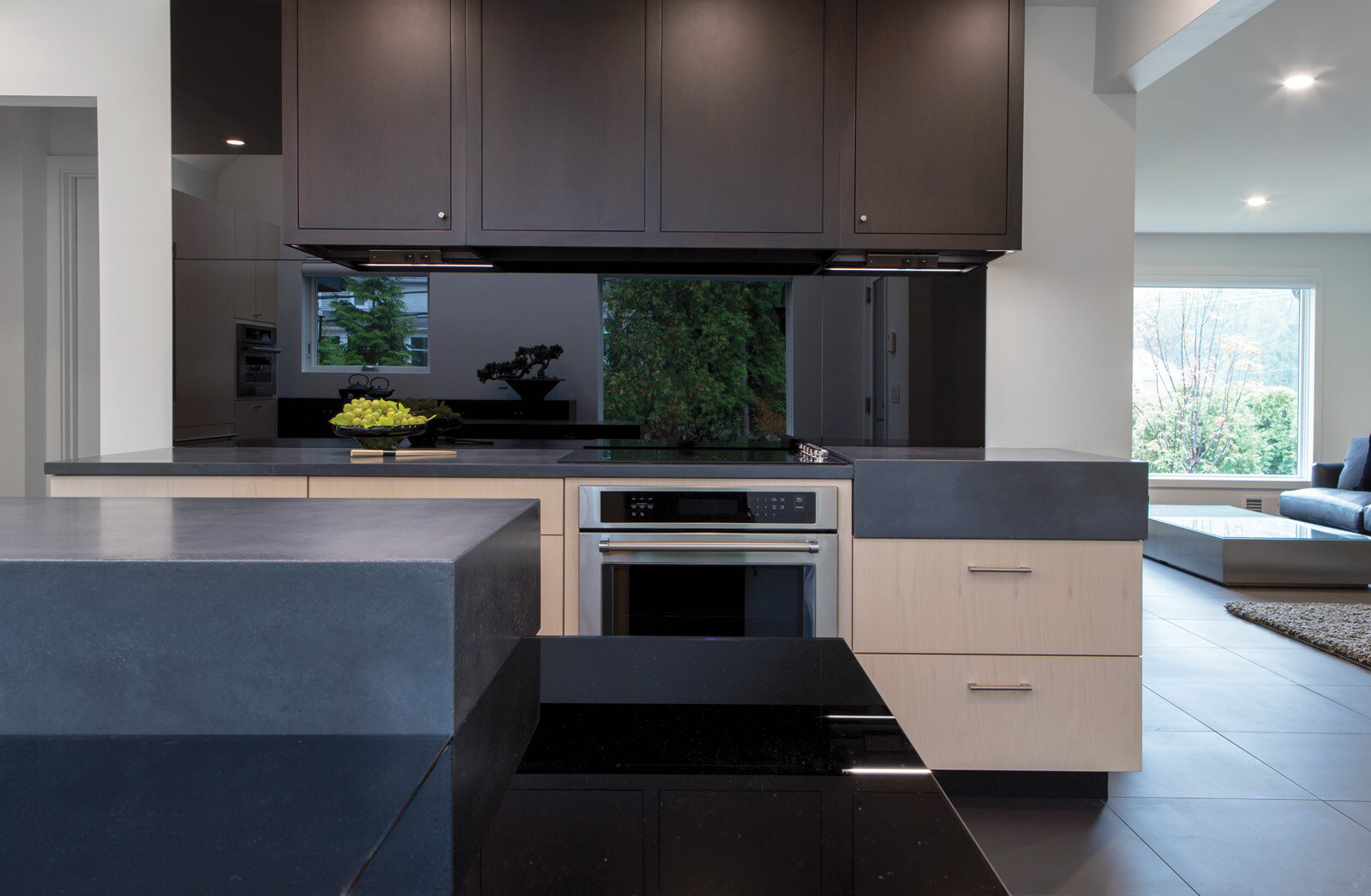
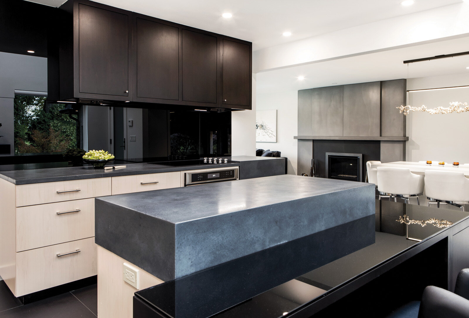
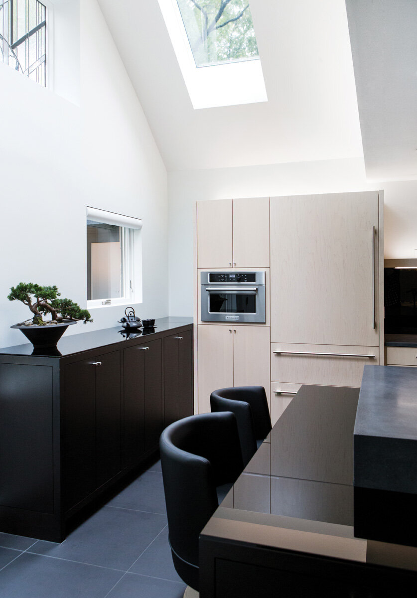
Motivated by their Japanese inspired landscaping, the homeowners were weary of their traditional kitchen filled with nooks and crannies. Known for their deliberate presentation of form and simplicity, Japanese Zen gardens are peaceful retreats that impart a sense of balance and harmony to a busy mind. “They (the homeowners) wanted continuity in that design and sentiment,” Director of Design and Sales at Concept II, a kitchen and bath showroom in Rochester, New York, Pamela Dailey says.
ROOM TO BREATH
Dailey opened the kitchen to the adjoining room while reorienting the island and large appliances to alter the flow of traffic and kitchen work. A vaulted tray ceiling punctuated with a skylight brings the geometric lines overhead while allowing natural light to bathe the space below. Instead of incorporating decorative elements, this space revels in the absence of ornamentation. Glass windows have no moldings. There is neither trim work nor artwork. Large format, black porcelain floor tiles reduce grout lines.
A seamless flow of dark continues from the thick black concrete countertops to the black, back-painted glass backsplash, concealing the hood. Like yin and yang, frameless Wood-Mode cabinets in dark cherry and Champagne maple demarcate functional spaces as sculptural forms.
The kitchen itself becomes the visual element. “It’s a combination of negative and positive space. Each reads separately and all achieve a collective flow,” Dailey says.
A PLAY ON FIGURE-GROUND
This play on the volume is also expressed in the island with a dark lower segment of cabinetry that extends wider than the lighter section. Dailey’s goal was to have each portion of dark and light be deliberately defined as its own shape rather than having it all blend together.
“They (the homeowners) wanted continuity in that design and sentiment.”
—Pamela Dailey
HARMONY IN CONTRASTS
Just as dark balances light, organic form balances geometric lines. The warm flow of fire flames becomes the fireplace’s visual focal point. Like the countertops, which were designed and made by Standard Concrete, of Rochester, New York, the fireplace is also cast with a custom color. Light bounces off the subtle changes made by the slightly different depths in the changes of planes above the mantel.
Cast in the shape of coral, a minimalistic pendant light from Art + Alchemy anchors the bright white dining set from above.
“This kitchen is very composed. Finding the right balance was tricky, but it’s not meant to look tricky,” Dailey says.

