heart and hardiness
Bold beams. Earthy materials. Robust elements.
A new timber home’s kitchen and bar melds the aesthetics of an unlikely pairing: rustic elegance seasoned with industrial details. Hardy, traditional features and a brilliant floor plan deliver high-end functionality and luxury. Think in terms of using what’s tried-and-true in surprising ways.


Functional Becomes Form
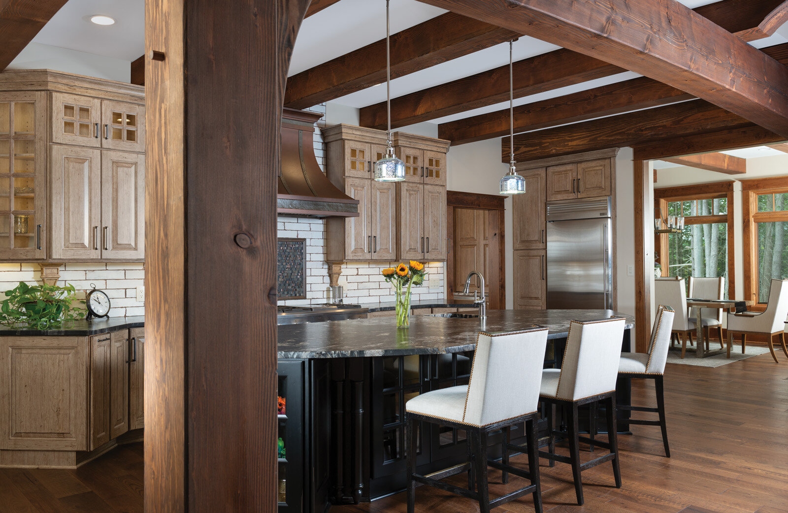
There is authenticity in exposing a home’s structural elements. This is something that Timberbuilt, the builder, understands well. Large posts and dark, bold beams crisply defined against a white ceiling exert the sturdiness and permanence expected in a timber home. In contrast to the kitchen’s cozier vibe, the bar is set in a voluminous space under a soaring wood ceiling and support timbers.
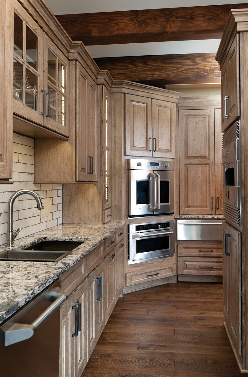
The kitchen area is comprised of two zones. The main kitchen is outfitted for entertaining with appliances that support cooking and light prep work. The pantry, with its hearth oven, dedicated freezer, and warming drawer, is where the heavier lifting takes place.
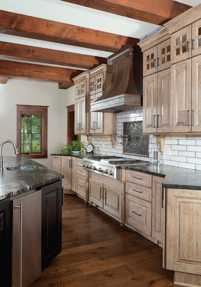
Jennifer Hutton, designer with Artisan Kitchen & Baths, explains, “This separation of function helps emphasize the homeowner’s lifestyle and preference.” Flowing organically from one space to the next, the zones are united by two prominent features. Continuous across both spaces, the knotty alder perimeter cabinetry with a Buckskin Appaloosa finish brings out the rustic flair. Pulling from the industrial chic genre, the pantry and kitchen backsplashes are a white ceramic tile with an experienced brick look. The brick-like tile also adds brightness.
Style Icons
Not only does the kitchen deliver a great cooking experience, it’s also on the forefront of a new trend of incorporating darker finishes and materials. Emphasizing its earthy, almost ranch-like vibe is the strategic use of a third wood species. Lightly distressed maple cabinetry supports a leathered granite island counter, identical to the kitchen counters. The pantry counters required more of a workhorse solution. Cambria quartz in an ombré of whites, browns, and grays was the answer. The real showstopper, however, is the cooktop. Hutton brought the central part of the back wall forward. An unexpected use of chunky, yet stately, furniture legs flanks the cooktop. Their curves are echoed in the corbels under the cabinet.
Urban industrial touches balance out the design. The hammered, copper cooktop hood and distressed metal fixtures reminisce to a more primitive age of manufacturing. Instead of covering appliances in wood paneling, the stainless steel adds an urban polish.
Watering Hole
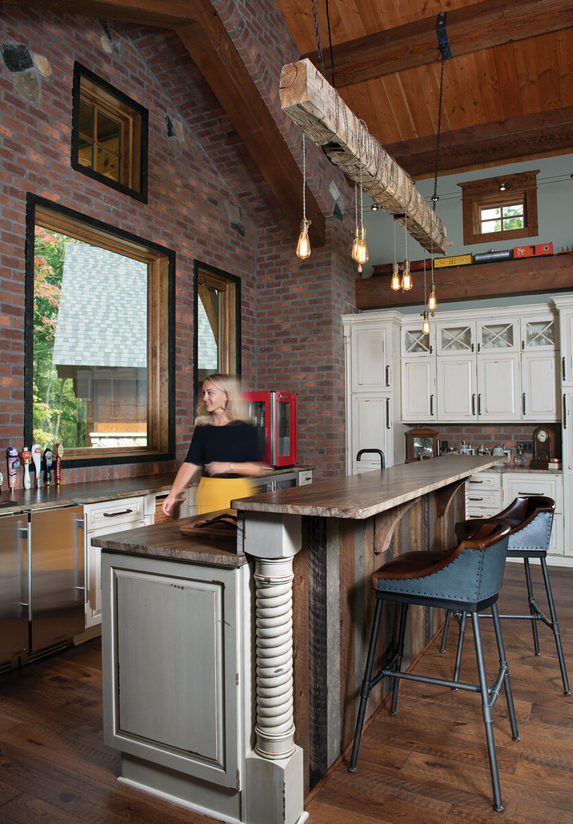
As a place to have a good time, the bar is loaded with style along with many of the homeowner’s personal touches. The beam chandelier is from a family member’s barn and the beer taps were a distinct homeowner request.
The island and perimeter Dura Supreme cabinetry in a Heritage finish carries a slightly distressed, rubbed appearance. Different colored palette barnwood and rope-carved posts play up the rustic theme. Granite countertops have a scalloped detail where some of the cabinets are pulled forward for curvature and movement. All of it backdropped by a fabulous, industrial brick veneer wall.
“These are a perfect representation of that hardy and chunky feeling. It anchors you in solid comfort,” says Hutton.

