Cooking up Farmhouse Fresh
It’s official. Modern farmhouse is the most popular home style across 42 states (and the Northeast), according to a Homes.com 2020 survey of 5,000 homeowners. Quiet and pragmatic, this genre layers a purposeful and practical design that is both simplistic and interesting. Done right, this pared-down aesthetic sparkles with personality.
How does one execute a modern farmhouse design concept to perfection? It starts with the kitchen.
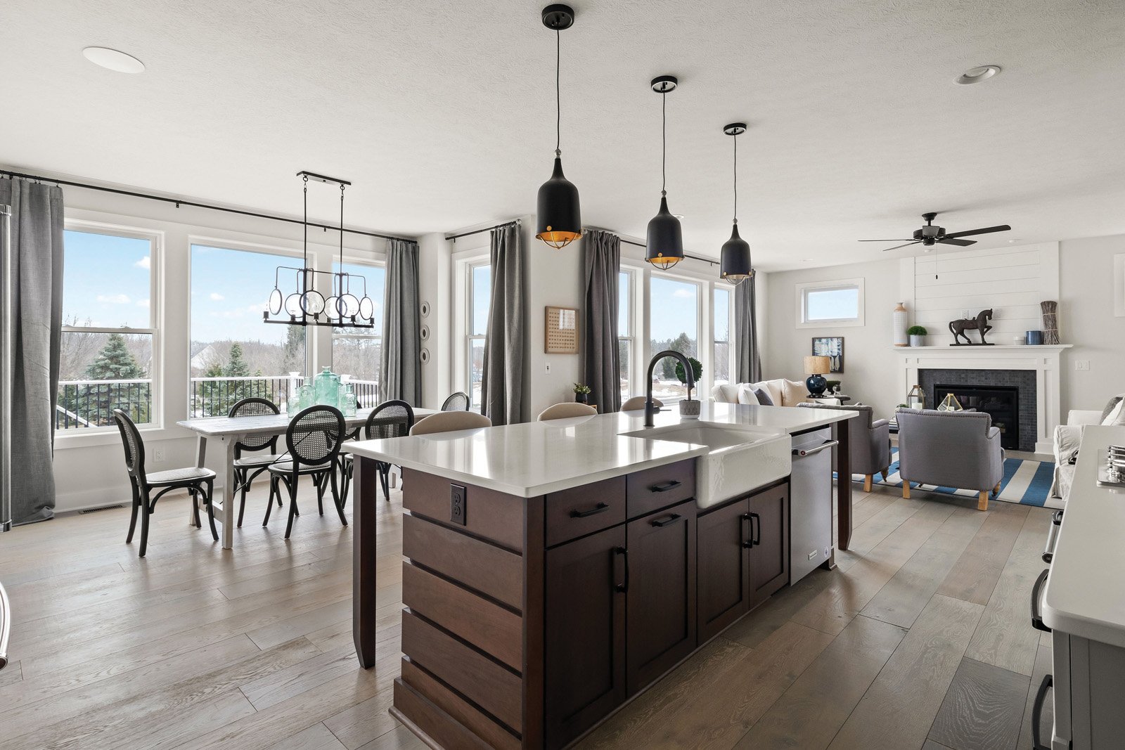
Open floor plans encourage togetherness by making the kitchen and dining areas the heart of a modern farmhouse. The kitchen/dining room in this Piper Meadows model — a community by Morrell Builders and designed by The Inde Design Studio — occupies the home’s center.
“I envisioned a light, airy kitchen,” says kitchen and bath designer with The Inde Design Studio, Allegra Fronczak. “It breaks from traditional style with simple moldings, crisp hardware and bright, fresh colors. Mixing warm and cool tones achieves a richness and serenity.”
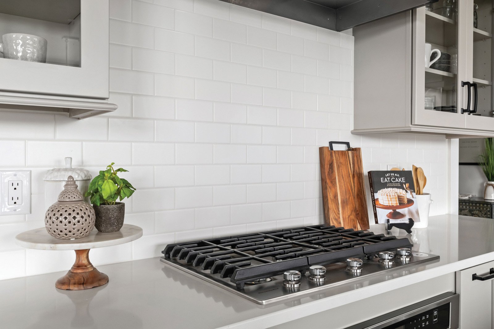
The space carries the initial appeal of a white kitchen without looking trendy. Using elements that harken back to the genre’s agrarian, farmhouse legacy ensures timelessness and warmth. This includes the island’s white cast iron farm sink, subway backsplash tiles, and glass cupboards. Matte surfaces emphasize the multiple wood components that show up in the engineered wood floor and cabinets.
“There are four different cabinet finishes!” exclaims interior designer for Morell Builders, The Inde Studio and owner of Meme Hill Studio, Amie Freling. “That may sound chaotic, but it’s cohesive.”
Details
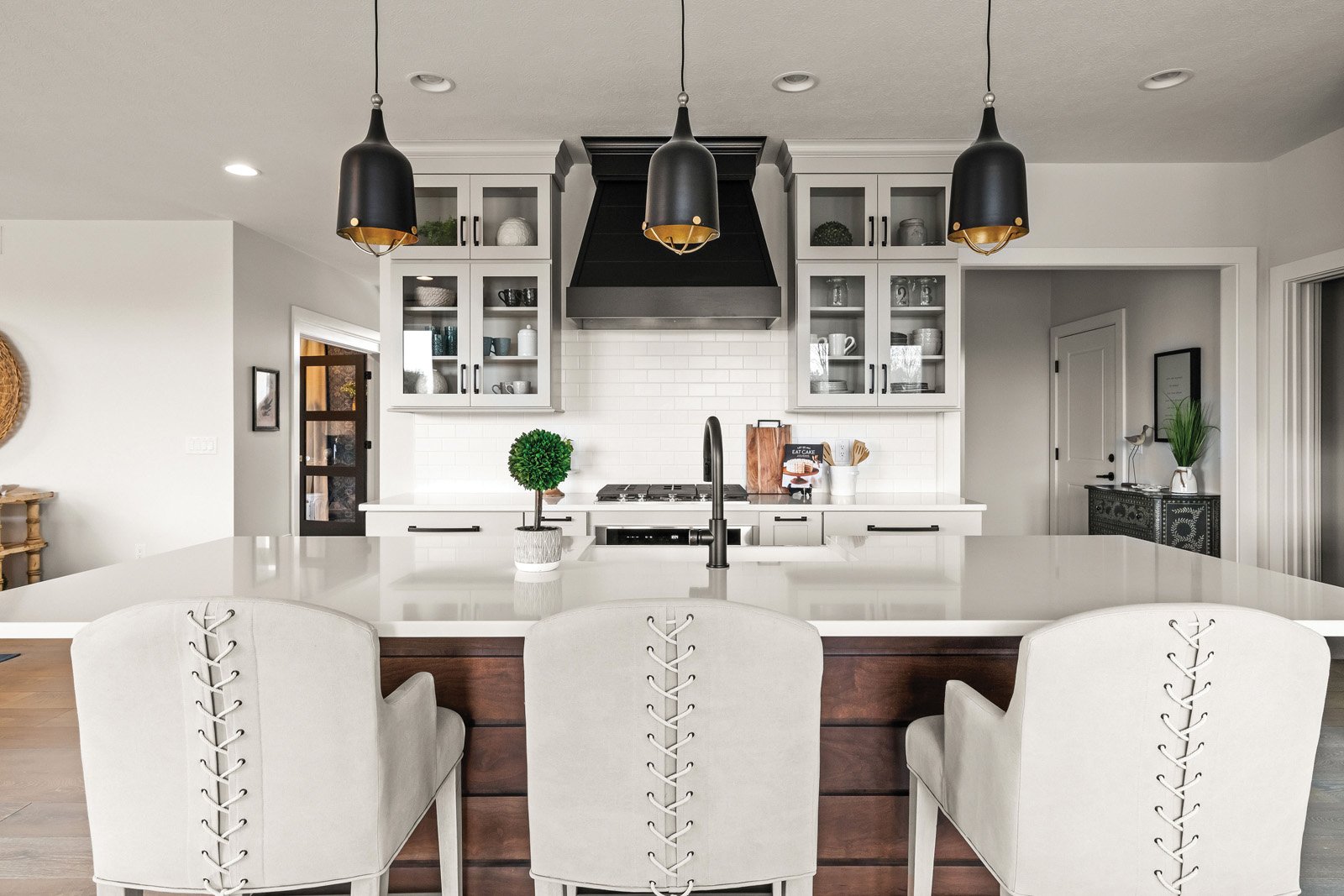
Freling provided something of interest from every angle. Visually intriguing, gapped cherry shiplap anchors the space with wood’s inviting demeanor. Pendant lighting stays true to a farmhouse’s utilitarian style, but a sophisticated interior touch of gold elevates the look and draws the eye upward. Welborn Cabinetry island cupboards are stained cherry.
Other kitchen cupboard finishes include gray mist with prairie style doors for the perimeter, a maple matte black hood and white cabinets in the pantry. Although fresh and contemporary, the MSI quartz counters in Arctic White are businesslike and practical. The pantry counter features black soapstone.
“These are not about the splashy, look-atme counters,” Freling says. “It’s understated beauty.”
Plumbing fixtures, lighting and hardware are all in a matte black, a consistent theme throughout the house. Island chairs strut a sassy, lace-up detail. Statement curves in hardware, lighting and chair shapes balance the horizontal lines.
The dining table is made of Scandinavian wood and chairs are a modern take on a traditional cane back chair. In another vintage, farmhouse nod, the Progress chandelier titled “The Looking Glass” is made of pitted, concave glass circles with a hint of gold.
Freling observes, “I don’t see someone looking at this in 10 years and getting tired of it. It works because it is balanced.”


