Future Retro
It’s the real deal. Built in 1951, complete with curved walls and a step-down living room, this ranch home is a classic mid-century gem. When the new homeowners, Emily and Pete Fazio, purchased it in 2013, a steady stream of use and abuse over the decades made it ripe for a makeover.


Make it Right
Design Resources
The Fazios started by painting everything white, installing maple floors and replacing windows in the kitchen. Emily Fazio also started a mood board. She was inspired by European kitchens with their timelessly fresh styles.
“We sat on ideas for five years to see what we liked about the house and cultivated a wish list,” says Fazio.
The couple’s biggest struggle was to make the modestly sized house truly functional for a family of five and their dogs. They decided to hire an interior designer, Robin Muto of Robin Muto Interiors. This was a big decision. Emily Fazio runs Merrypad.com, a successful do-it-yourself (DIY) lifestyle and home improvement blog. It was her extensive, DIY experience that motivated her to hire a professional.
Muto delivered multiple plans. Recognizing that some of their wish list items did not work as they had envisioned, the Fazios were moved by Muto’s designs with clean, low lines that recognized the home’s mid-century merits.
In-the-Moment Retro
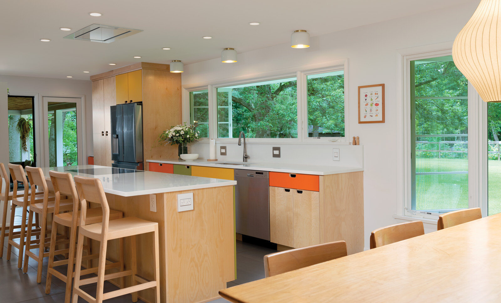
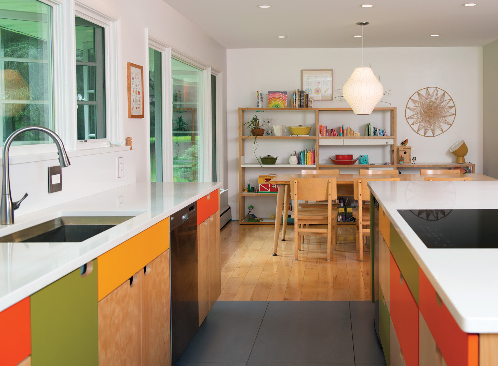
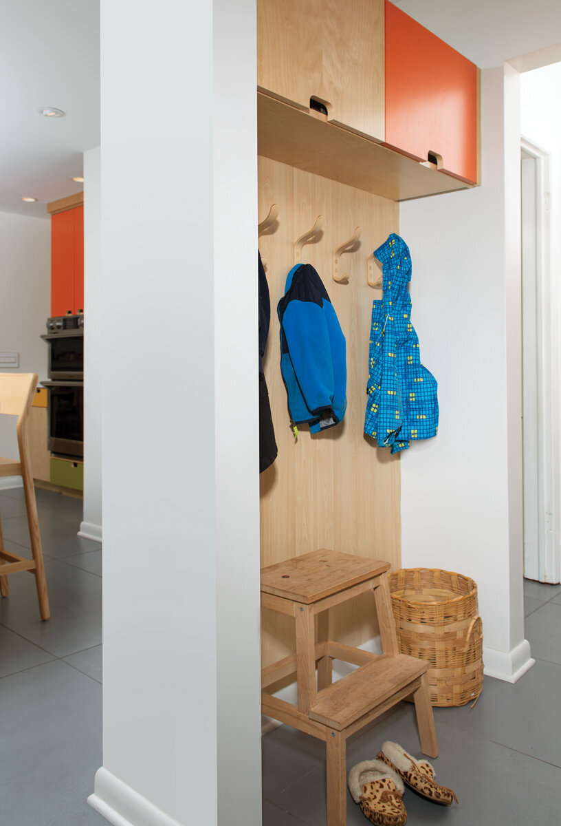
Removing the wall between the kitchen and dining areas significantly opened the space. A large glass door leads to the patio, extending the livable space to the exterior. A half-wall (inspired by a photo Fazio found) does double-duty by blocking the kitchen’s view into a bathroom and establishing a “mudroom.”
“We did not overlay a 20th-century change on a mid-century home. We made it look like the house had been like that all along,” says Muto.
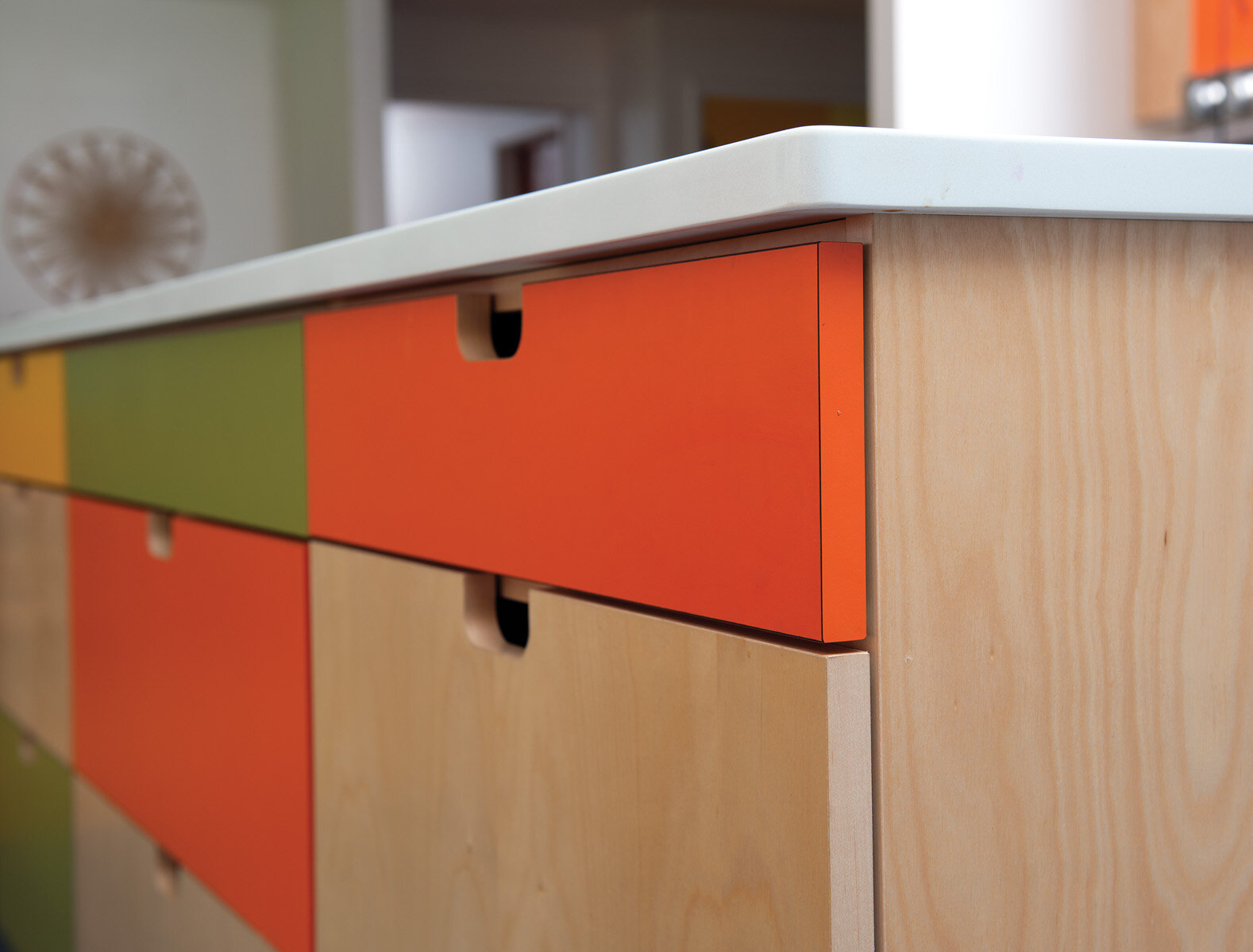
Inarguably, the birch, laminate cabinets are a standout feature and a defining nod to the home’s postwar style. With extra attention to detail, construction is flush with the frame, establishing an interior of fresh minimalism. Look closely for what is not there. Pulls, handles, knobs, and visible hinges are absent, relieving the space of visual clutter. In an intentional move, the playful orange, green and yellow coordinate perfectly with Fazio’s 1960s Copco cookware. The unusual colors were sourced from Europe.
The sleekness continues with a glossy, black induction cooktop set flush into the island. Flush-to-ceiling vents eliminate the need for a clunky, drop-down hood. Other modern features include countertops and a backsplash in white quartz. Radiant heat cozies up the hardy, oversized, 2-foot by 4-foot porcelain tiles in a dark gray, resembling concrete. Island chairs came from Design Within Reach.
In true DIY fashion, Fazio rescued and refinished the dining table and chairs from a local library that was shutting its doors. Overhead is a classic Nelson bubble lamp. Designed in 1951, the same year the house was built, it brings the retro-forward makeover full circle.

