One New Kitchen, Hold the Kitsch
WHEN MOST HOMEOWNERS DECIDE IT’S TIME FOR A KITCHEN REMODEL, IT’S USUALLY TO UPDATE THE STYLE OR IMPROVE THE FUNCTIONALITY. SOMETIMES, THE SPACE NEEDS A COMPLETE OVERHAUL, AS WAS THE CASE FOR THIS HOMEOWNER.
But Where To Begin?
Design Resources
Make it Functional
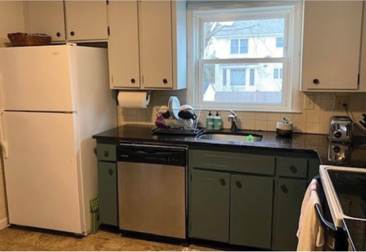
The L-shaped configuration of the appliances in the original kitchen (see “Before” picture) didn’t allow for much counter space or storage, and the other two walls weren’t utilized at all. The sparse brown cabinets and black stone countertop were not an appetizing combination either, especially against the dark tile floor. For a family who likes to bake, this was not a functional workspace.
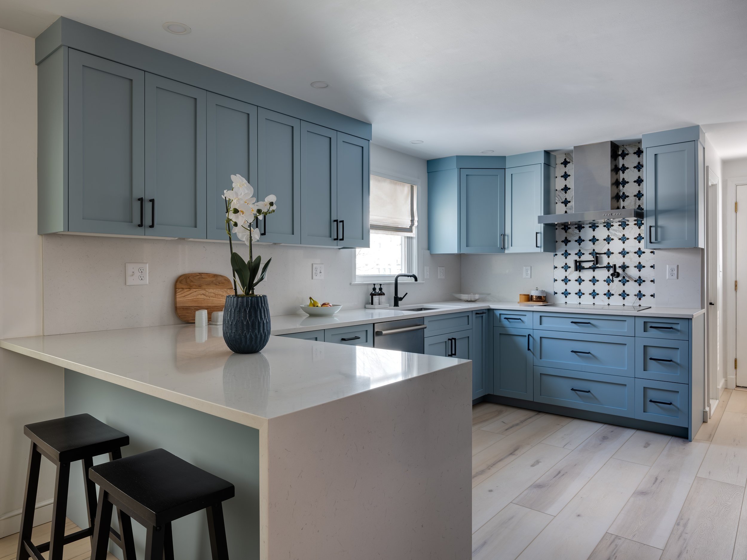
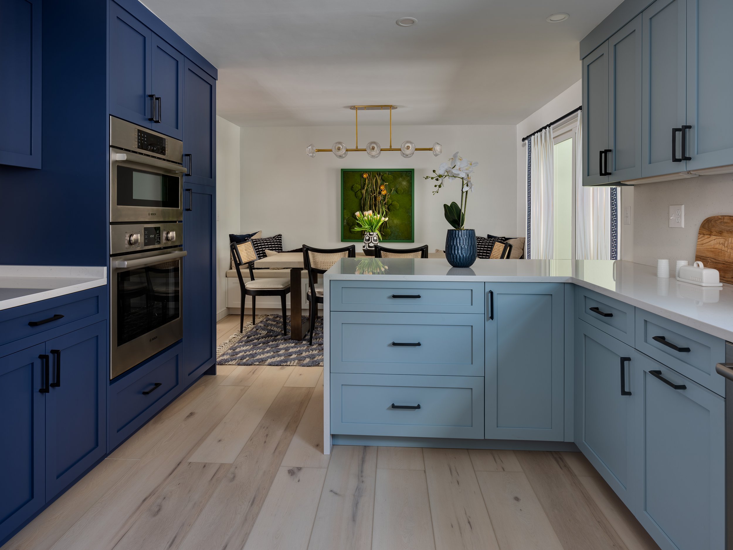
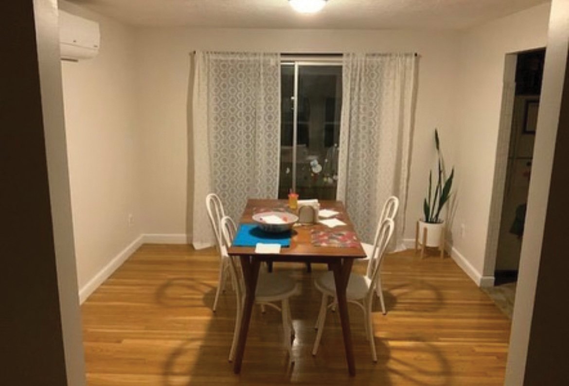
Taking out the wall between the kitchen and dining room allowed for the addition of a peninsula between the two rooms. This one change added counter space and storage, and made the kitchen look larger, brighter, and less closed off. It also allowed Bansal to steal some space from the dining room for a new wall of cabinetry to house two full-height pantries, a stainless steel refrigerator, and a built-in oven and microwave. Bansal made sure there was room for a landing space between the refrigerator and ovens, too. “It’s important to have a place to set items taken from the refrigerator or stove,” Bansal said.
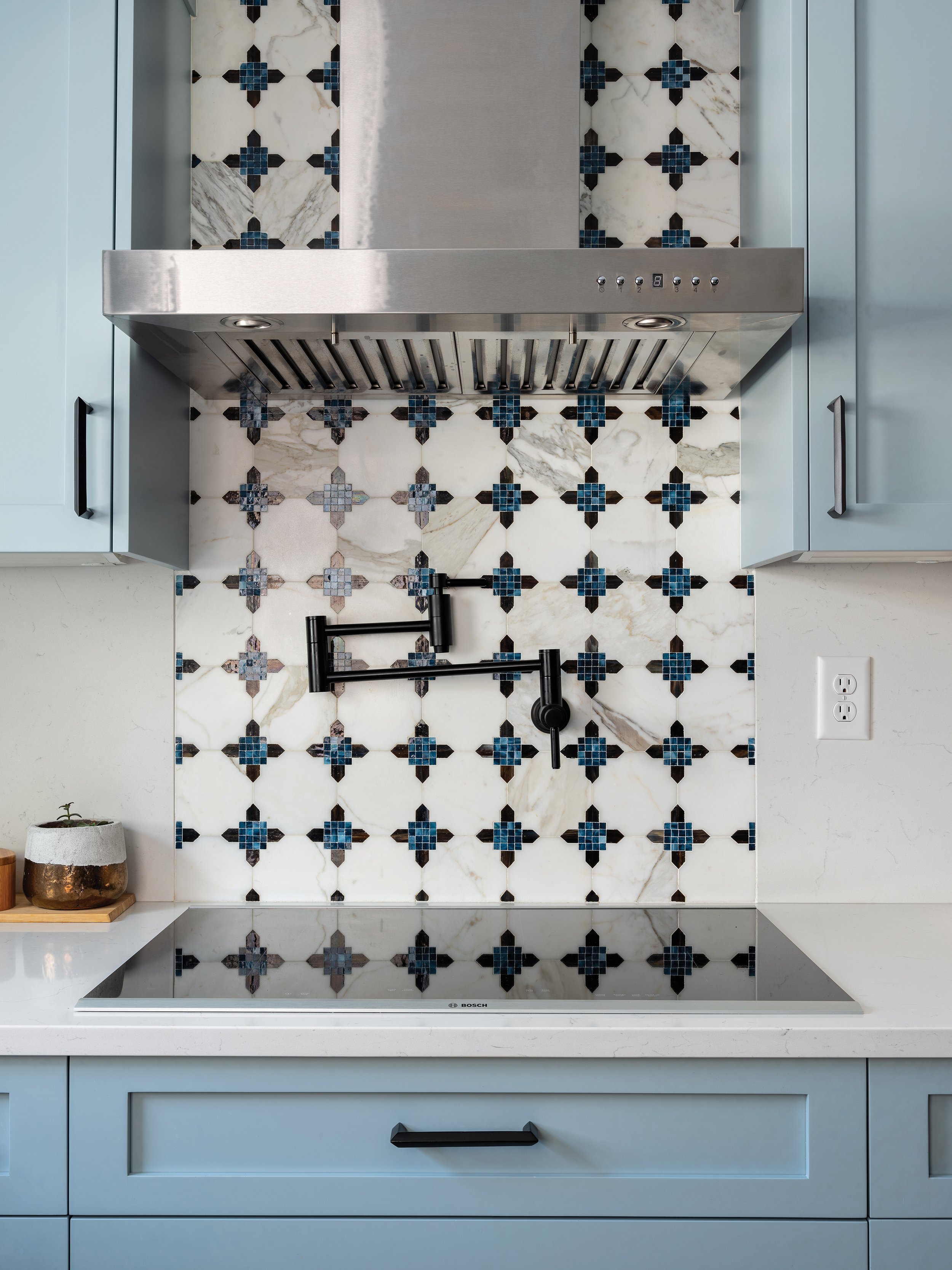
Utilizing all that previously unused space allowed room for a modern cooktop with storage underneath and a stainless steel range hood overhead. The sink and dishwasher stayed in the same location, but these got an upgrade, too.
Add In Aesthetic
When someone tells you they love the ocean, what do you envision? Did you say deep blue water, puffy clouds, seashells, netting, and sand? That’s what Bansal thought of when her client said she was partial to the ocean. Avoiding the common mistake of using kitschy decor to design in coastal style, Bansal took a crafted approach to refined style, with aspects of the homeowner’s story woven throughout.
The cabinets are two different shades of blue (indigo and slate) “to give depth, like the ocean,” Bansal said. The backsplash behind the stove is a mix of colored glass and natural stone in blue tones. Bansal purposefully used white on the walls and backsplash to represent clouds.
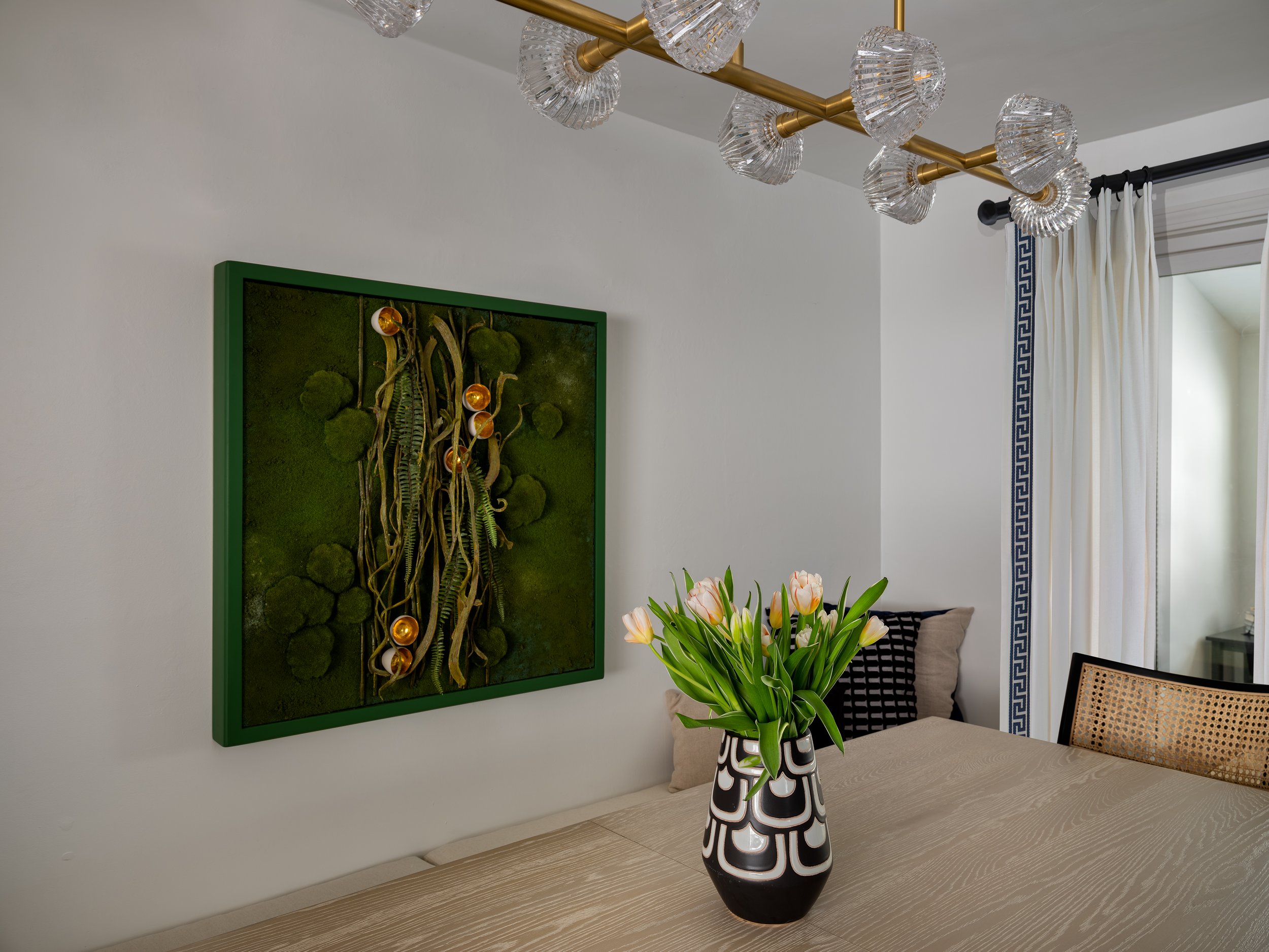
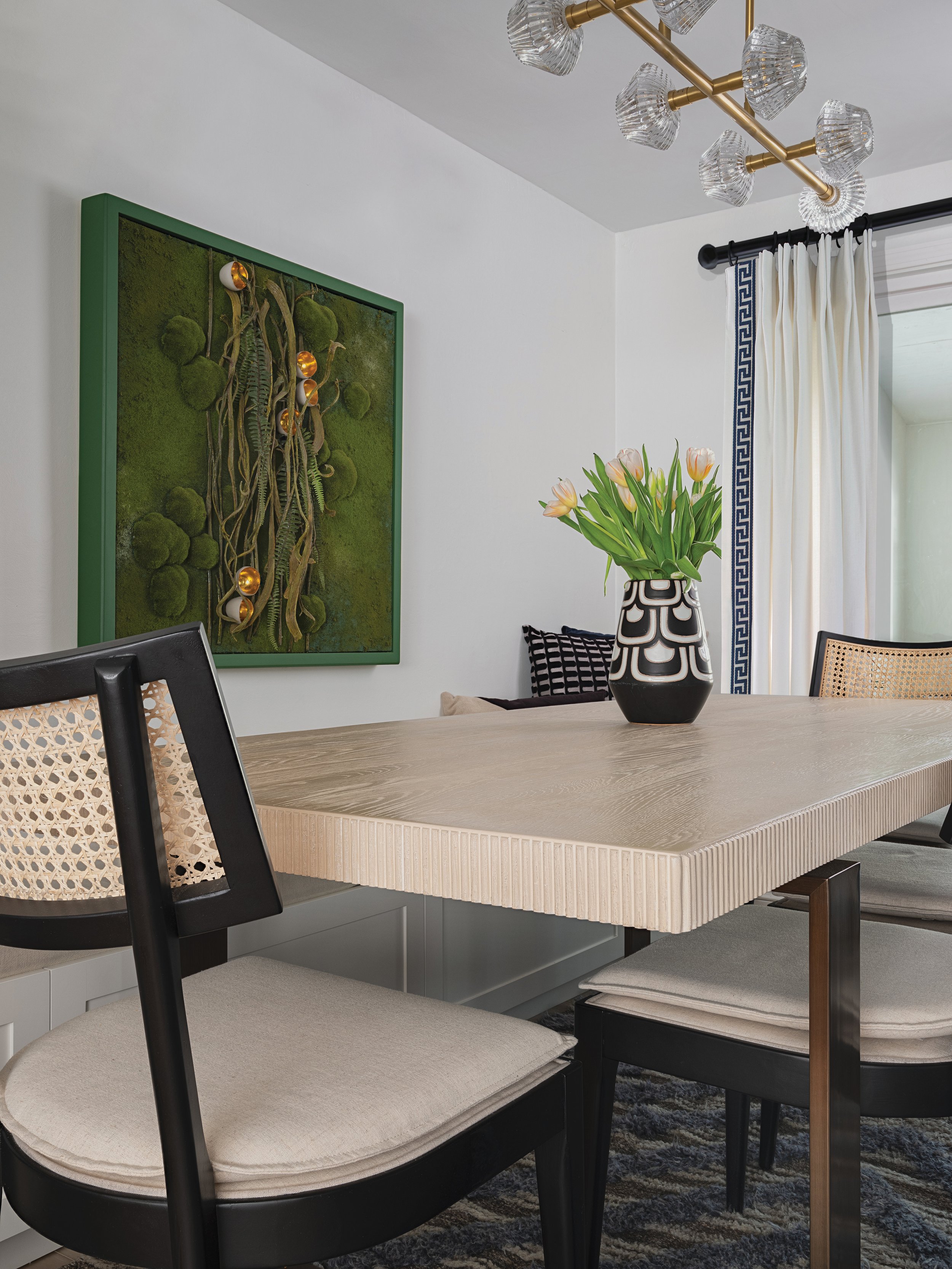
Blonde wood floors mimicking driftwood complete the picture in the kitchen. In the dining room, natural cane back chairs surround a rectangular dining table with a matte wood finish top and bronze base. A hand-knotted, blue herringbone area rug “looks like ripples in the water,” Bansal said, and serves to anchor the furniture in the room. Bansal said she chose the aged brass chandelier over the dining table because the glass shades resemble seashells. The final touch is the living art on the wall, which “depicts seaweed,” Bansal said.
DONE TO Perfection
Kitchens are difficult spaces to design because they need to be both functional and aesthetically pleasing, but with the help of an interior designer, you can achieve both.


