From Awkward To Fabulous
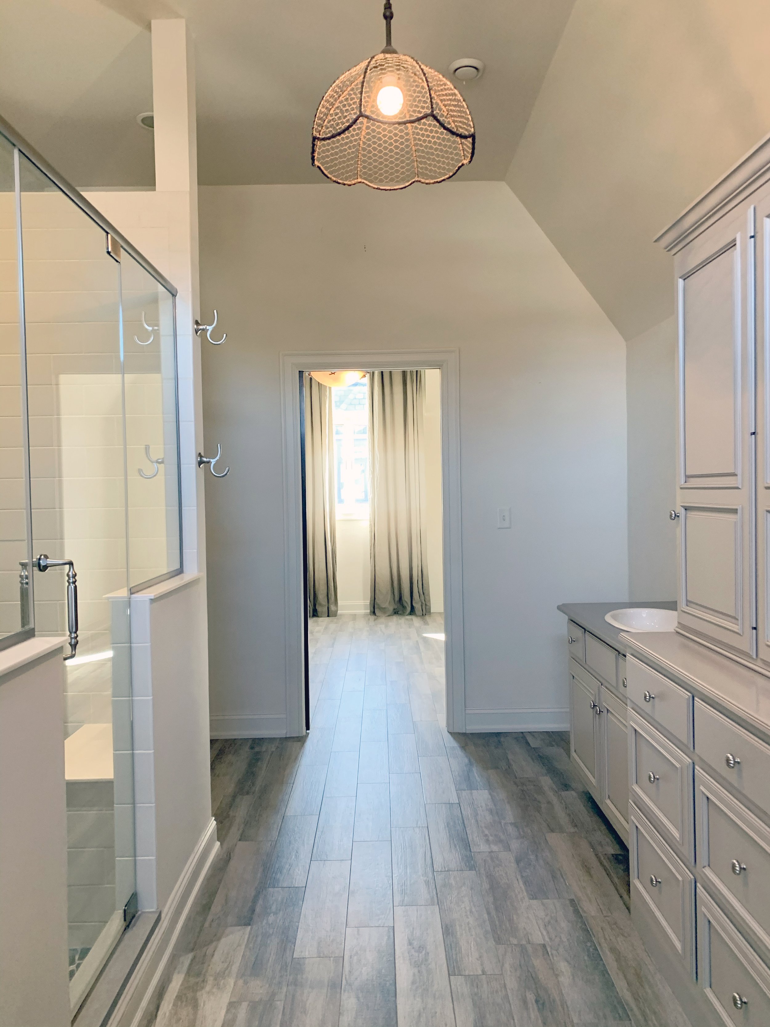
When Raelyn Capozzi first saw the master bathroom in the elmwood village home her clients had recently purchased, she knew the proportions and the scale were off.
“It had a lot of charm but also had tons of unused space,” said Capozzi, owner and principal designer of West End Interiors, which opened in 2018 in downtown Buffalo and now has eight employees. “It needed a fresh look.”
Capozzi and her team revamped the entire two-story Lafayette Avenue house built in the early 2000s. The master bathroom required renovations to expand a cramped vanity area, remove an awkward tower, and replace dated tile, inadequate lighting, and a utilitarian box shower.
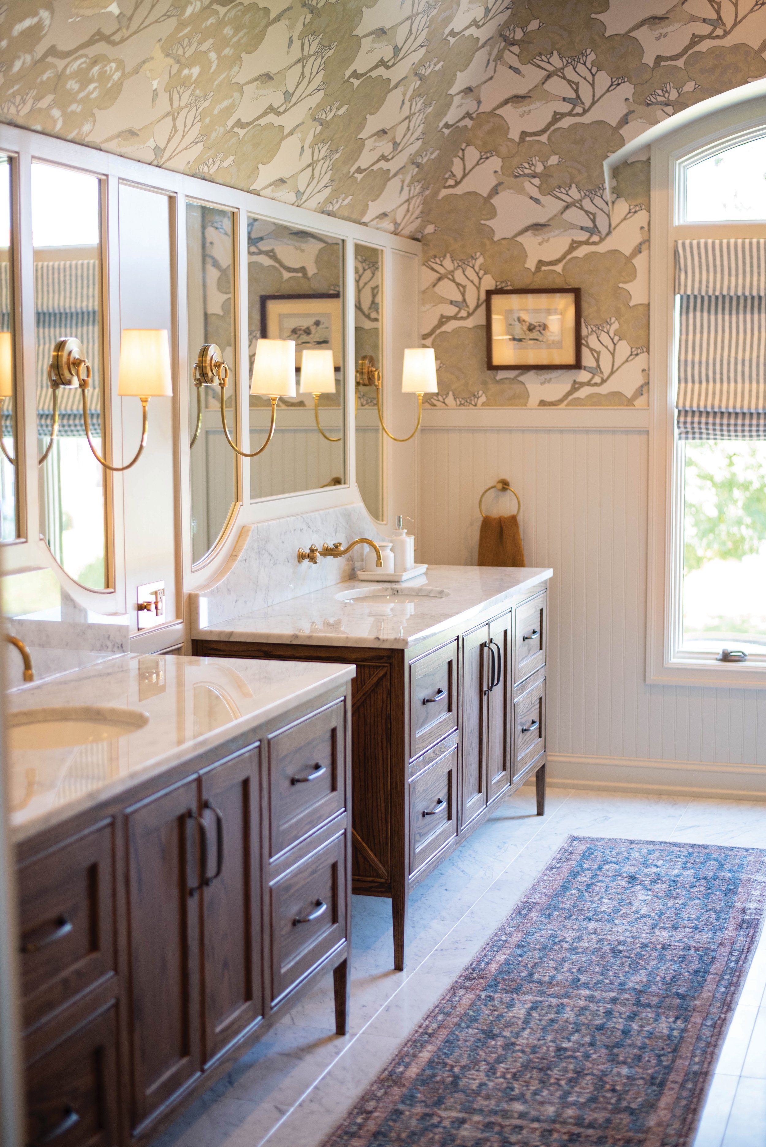
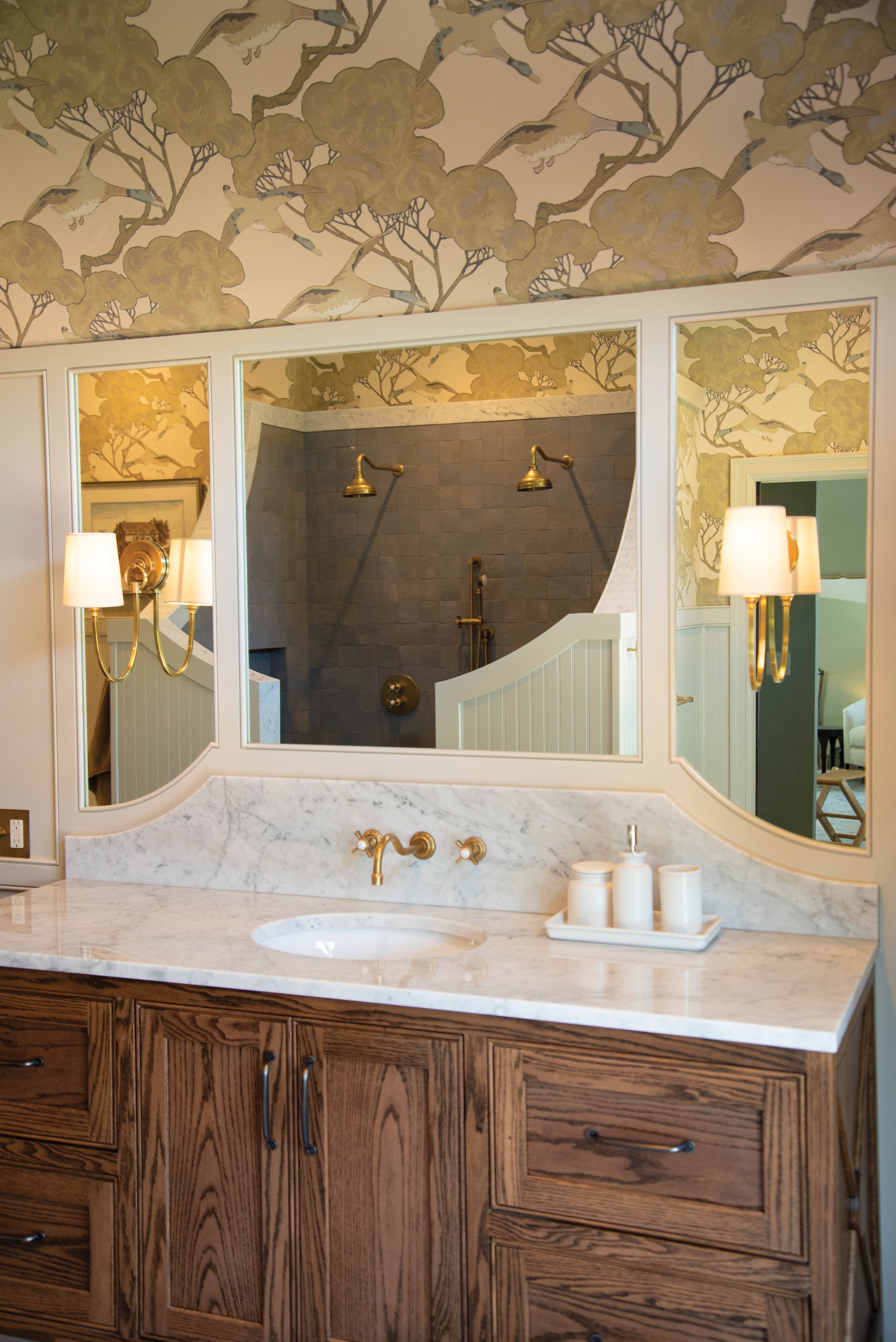
“We were able to knock out the existing vanity and redesign it with two larger vanities in a red oak located along the back wall,” she said.
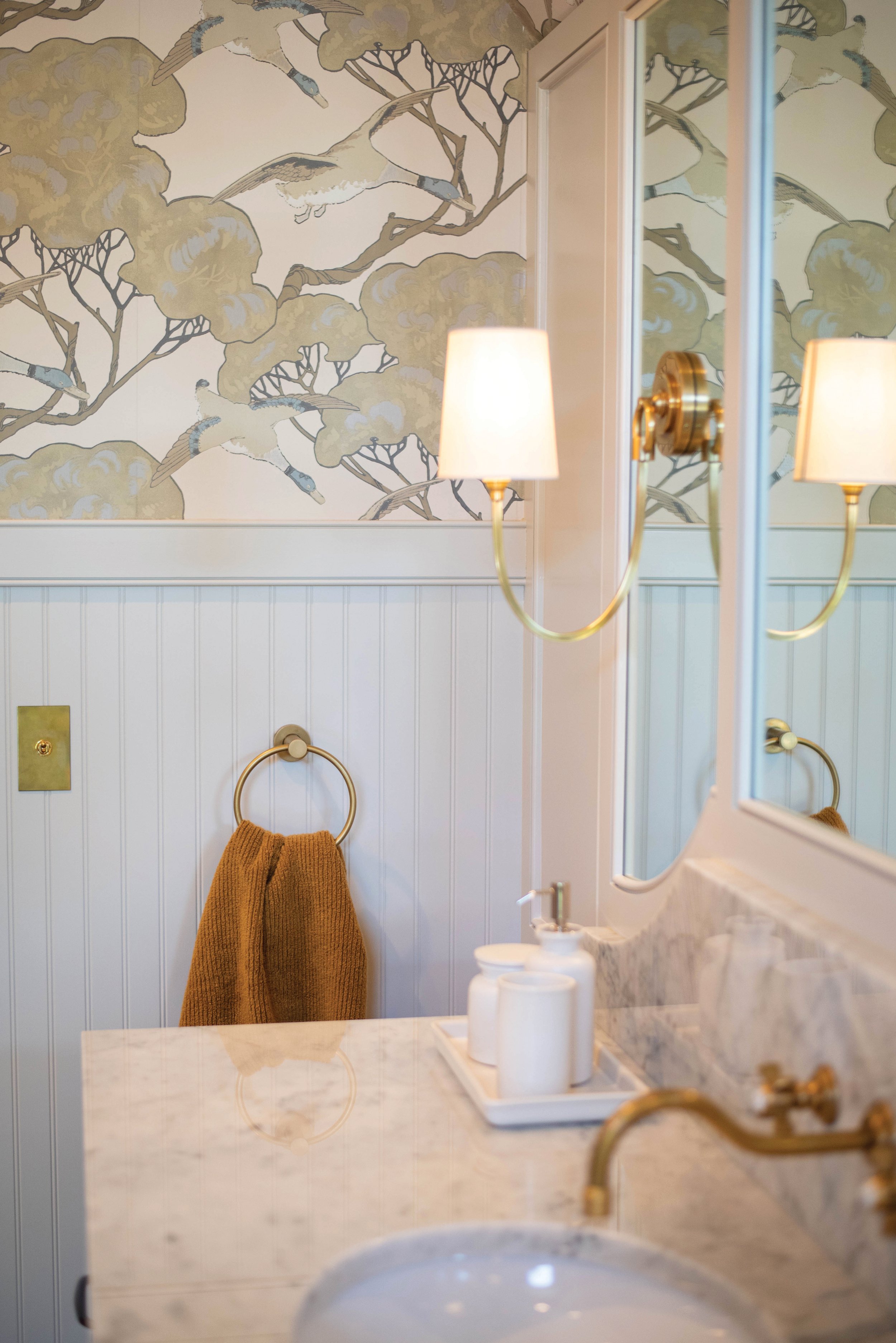
To fill the room with more light, Capozzi designed larger custom-sized mirrors to fit on the back wall above each vanity and flanked them with new sconces.
She and her team also replaced the wood tile floors with a cool marble in bluish gray that balances nicely with the warm tones of the vanity, trim, and antique brass finishes. They painted the beadboard and accent wall in a Sherwin Williams’ neutral hue called “Accessible Beige” and covered the rest in modern country wallpaper featuring ducks flying among olive green trees and a taupe sky.
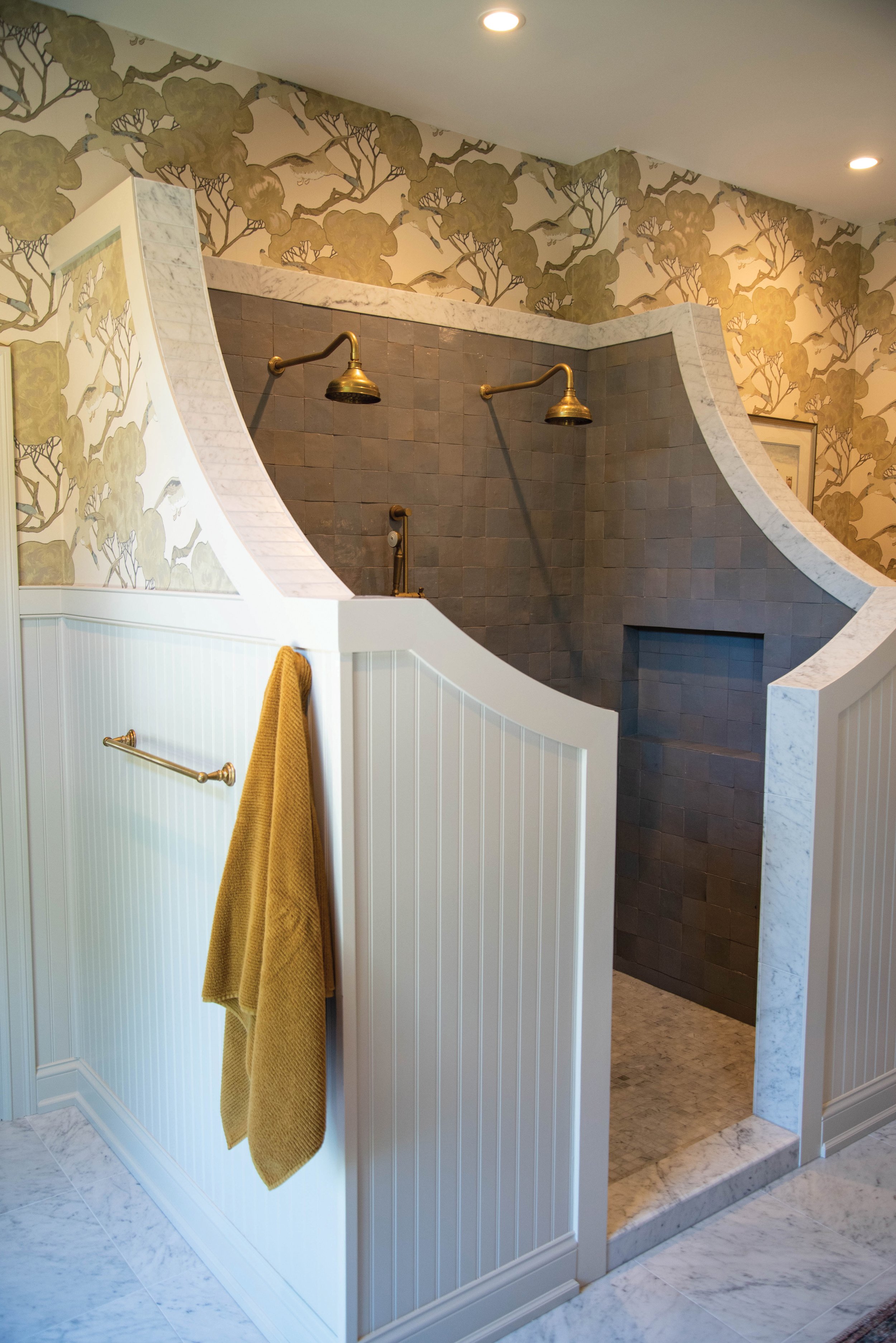
The crown jewel of the space, Capozzi said, is definitely the shower.
“It’s the most unique shower we’ve ever done,” she said. “There was a lot of curved molding and tile trim work, things we haven’t done before.”
They expanded the shower one foot, curved the surrounding walls, removed the shower glass, and added beadboard to the outside. The additional space in the shower allowed them to include two shower heads and two handheld nozzles. The final touch — installing a brilliant blue tile called “Shattered Pearl.”
Capozzi chose to hire one of her favorite tile contractors, Walter Crowe. He was able to cut and install the marble tile on top of the shower walls to follow the intricate curves.
“If you look at the design now, we have curved walls that match the curve in the vanity backsplash and the trim behind the vanity,” she said. “There was a lot of thought that went into how everything communicated with each other. It took time but was worth it.”
From the beginning, Capozzi said she worked closely with her clients to execute a clear vision that reflects a growing trend in bathrooms, one that layers materials in different textures and features warmer tones.
“I think people are getting a little tired of gray floors and white countertops,” Capozzi said. “They want more color and softness to their spaces.” The clients aimed for a new traditional look and Capozzi said she’s pleased with how the redesign turned out.
“It still has clean lines,” she said, “but it uses modern finishings and textures in a way that doesn’t feel sterile.”


