Anchored to a Mid-Century Makeover
Living on a boat, tethered to weather patterns, a rigorous schedule, and sparse accommodations is for those who crave open spaces and simplicity.
For three years, Spindrift, a single-mast sailboat, gave homeowners, Susan and Tony, the home and lifestyle they wanted.
When Susan and Tony decided to come ashore, they purchased a modest ranch-style home, site unseen. Yet something about the tired, mid-century home felt like a good space. Accustomed to sensible, uncluttered living, the house became a landed expression of the homeowners’ values while upholding the home’s 1950s spirit.
A SHIPSHAPE SHAPE SHIFT
The original interior listed three bedrooms, one and a half bathrooms, and an attic. Susan wasn’t worried about the space, but the wish list did not correspond to the home’s conventional layout. Architect and principal at Bailey and Harris, Trish Bailey, reconfigured and streamlined the interior space while staying true to its mid-century vintage.
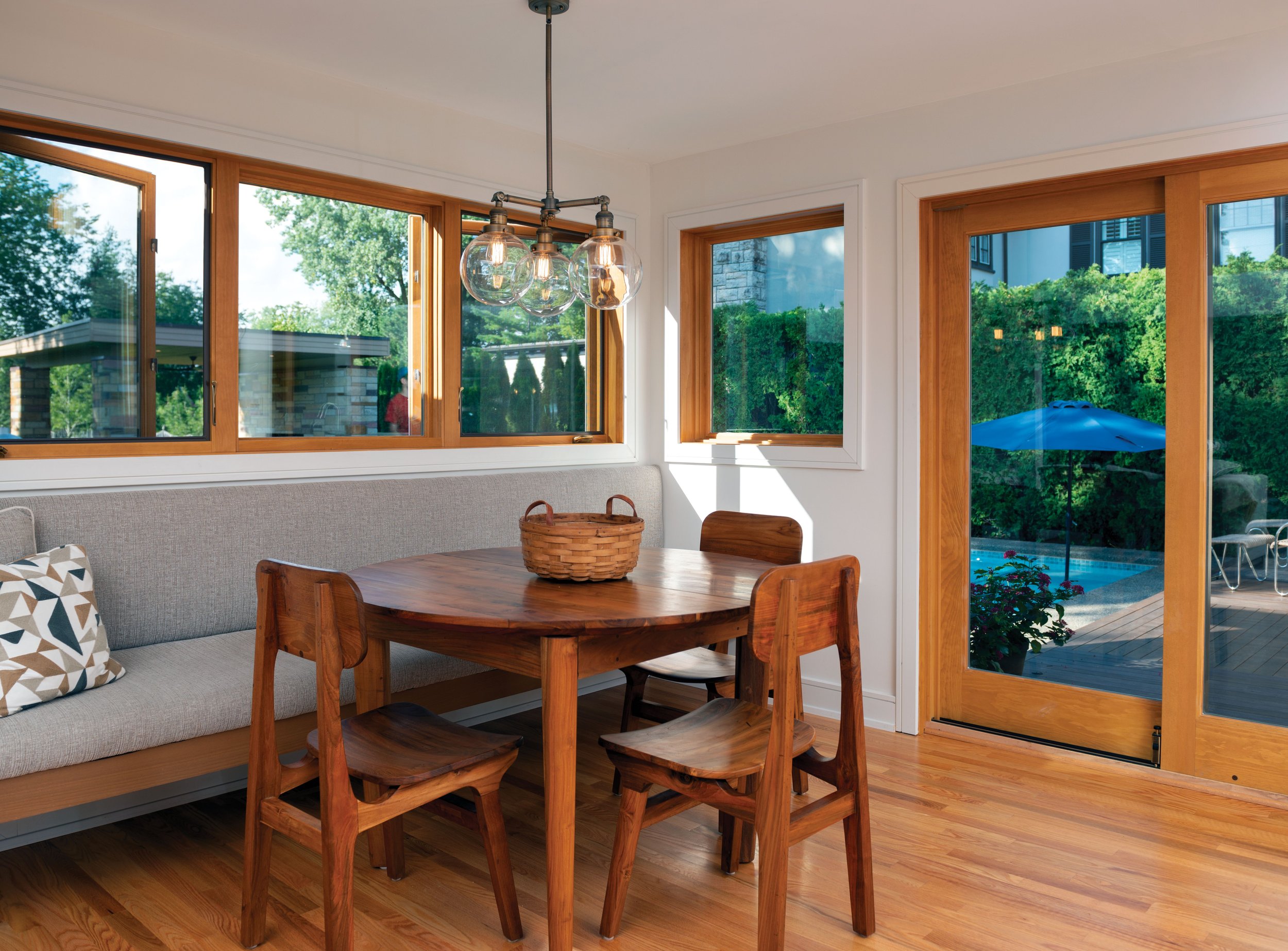
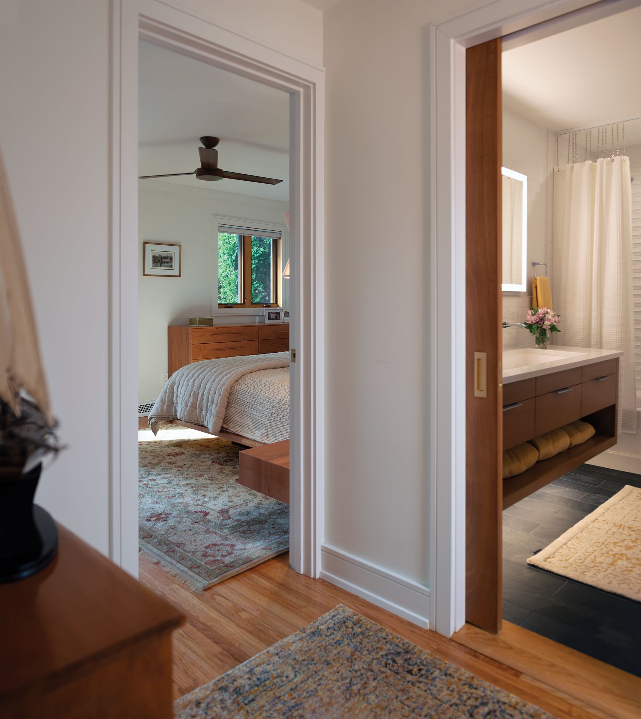
A closet became a bathroom, a bedroom became a walk- in closet, the living and dining rooms became a kitchen, and the attic became a bedroom. The homeowners got their entire wish list — a walk-in closet, first-floor primary bedroom suite, open floor plan, and pantry. Space was carved out to create a stairway to the guest bedroom loft. A small bump out for a banquette between the kitchen and exterior patio was the only added floor space.
Perfect Pad
The home’s stylish spirit emerged as its new layout was executed with functional design and pops of mid-century flair.
Susan recalls, “We loved the house’s natural light and clean lines. But once I knew it had mid-century bones, I didn’t want to deviate.”
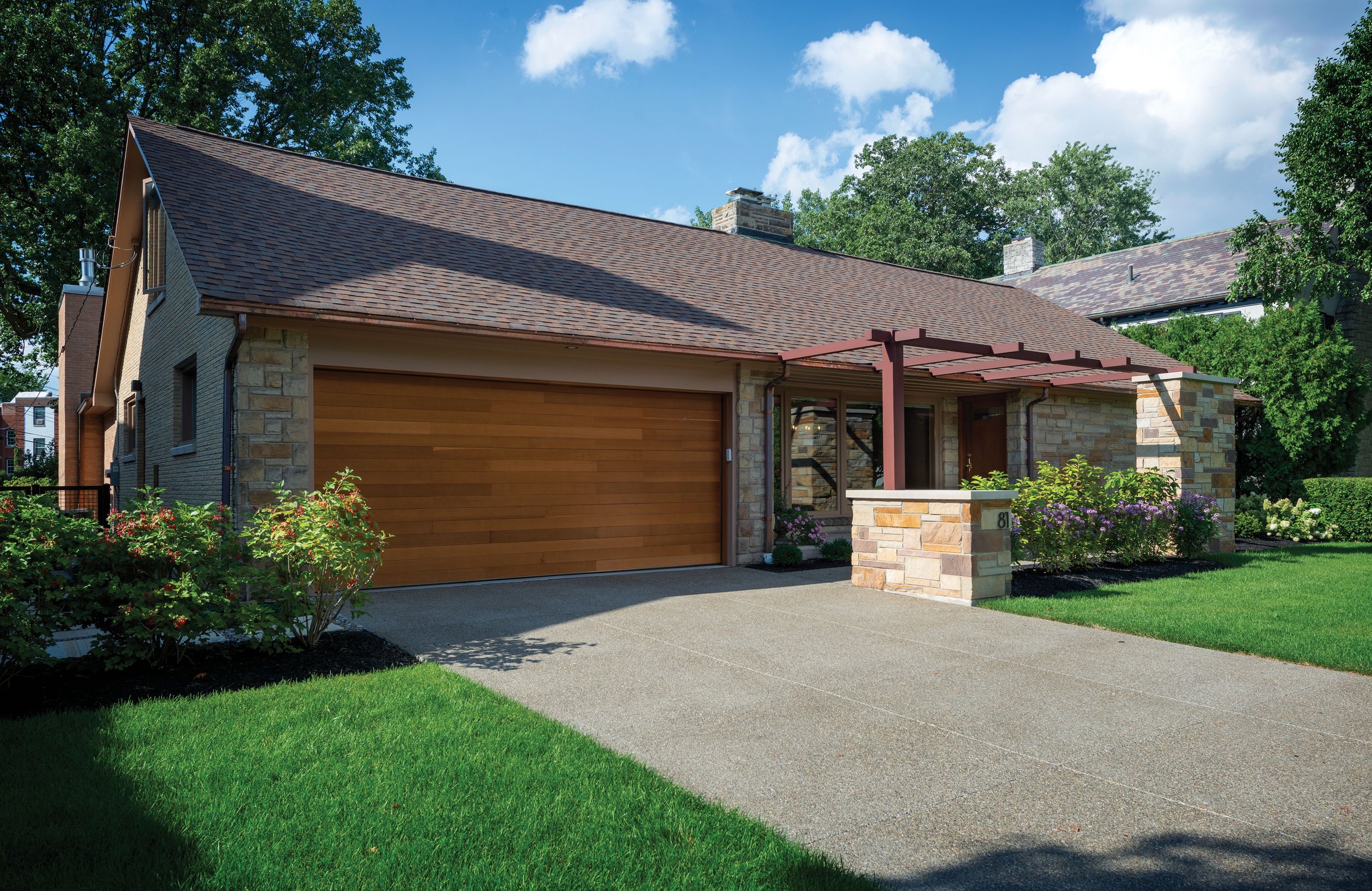
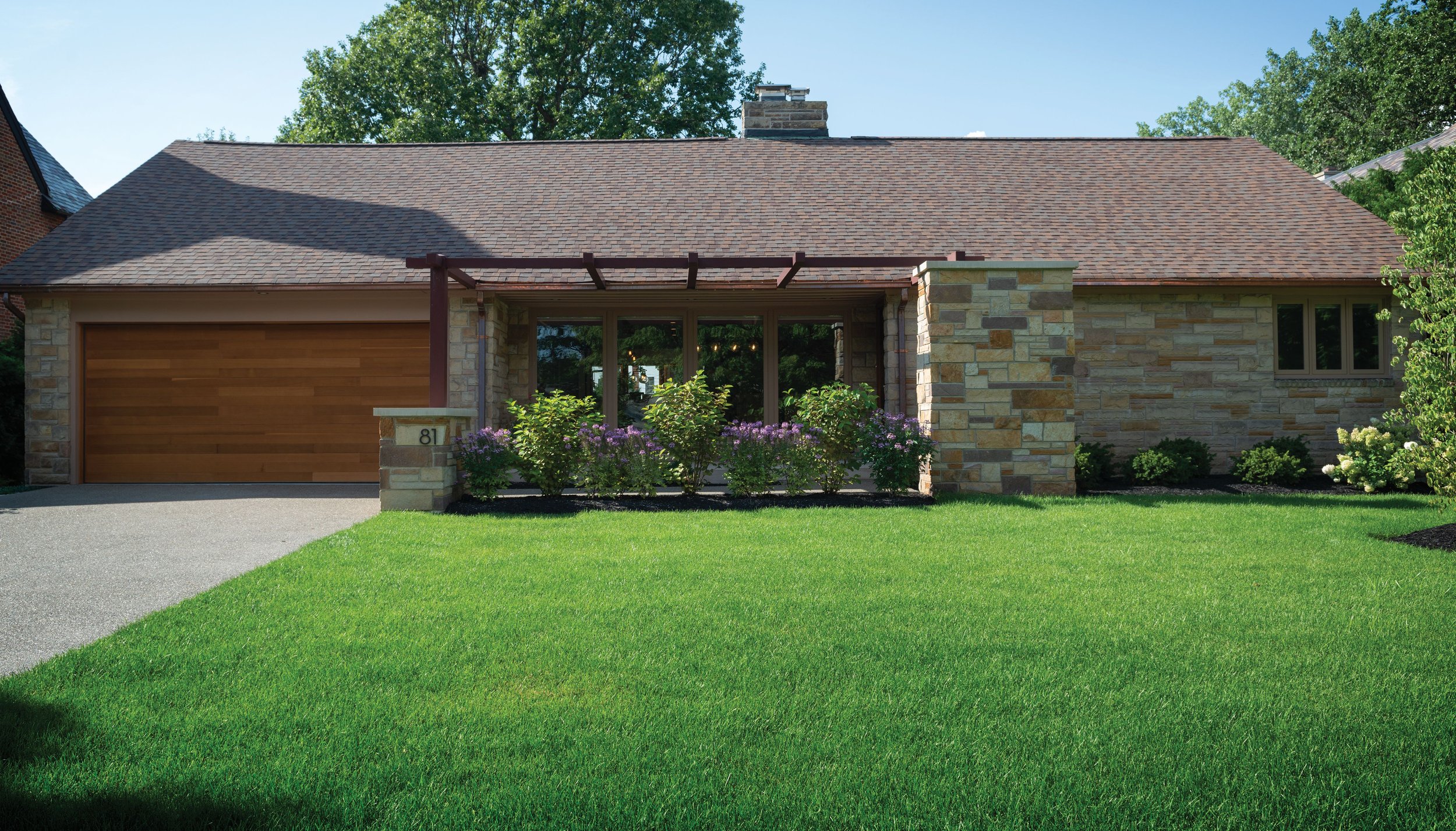
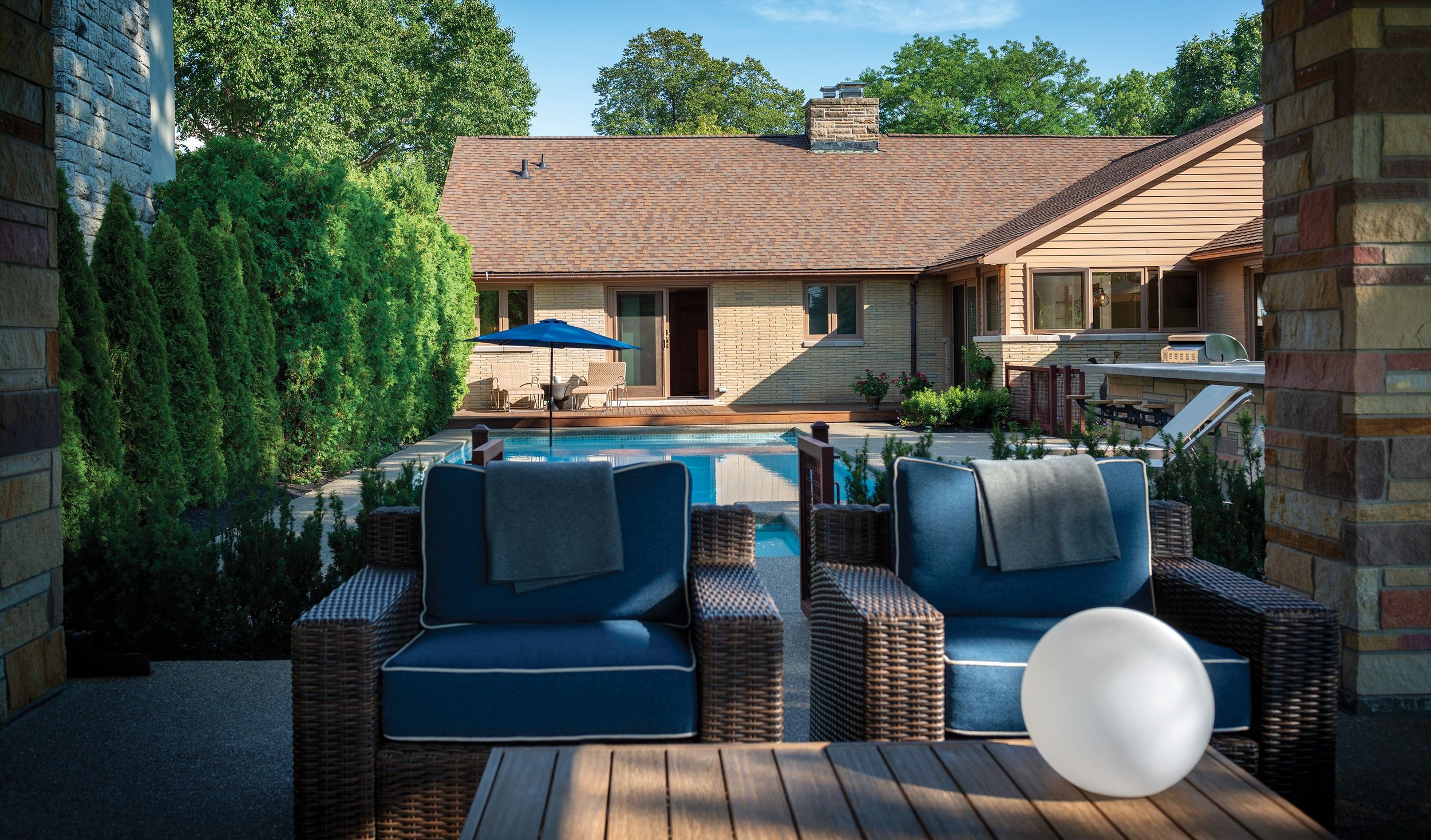
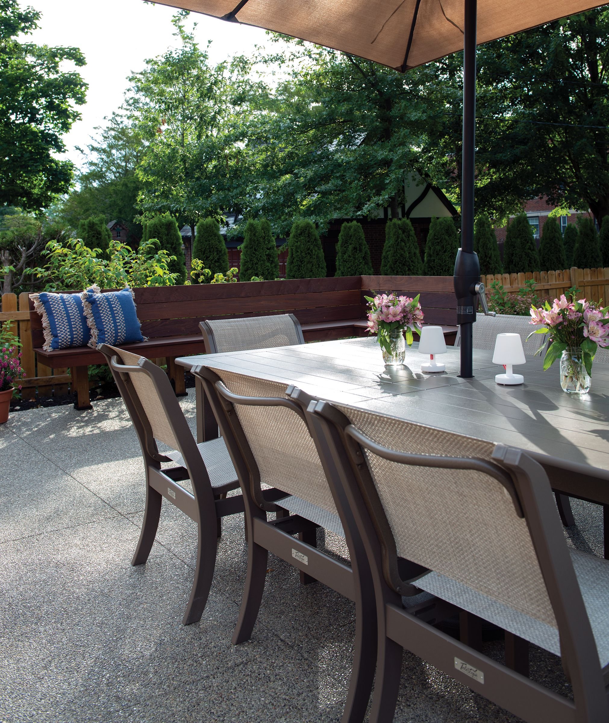
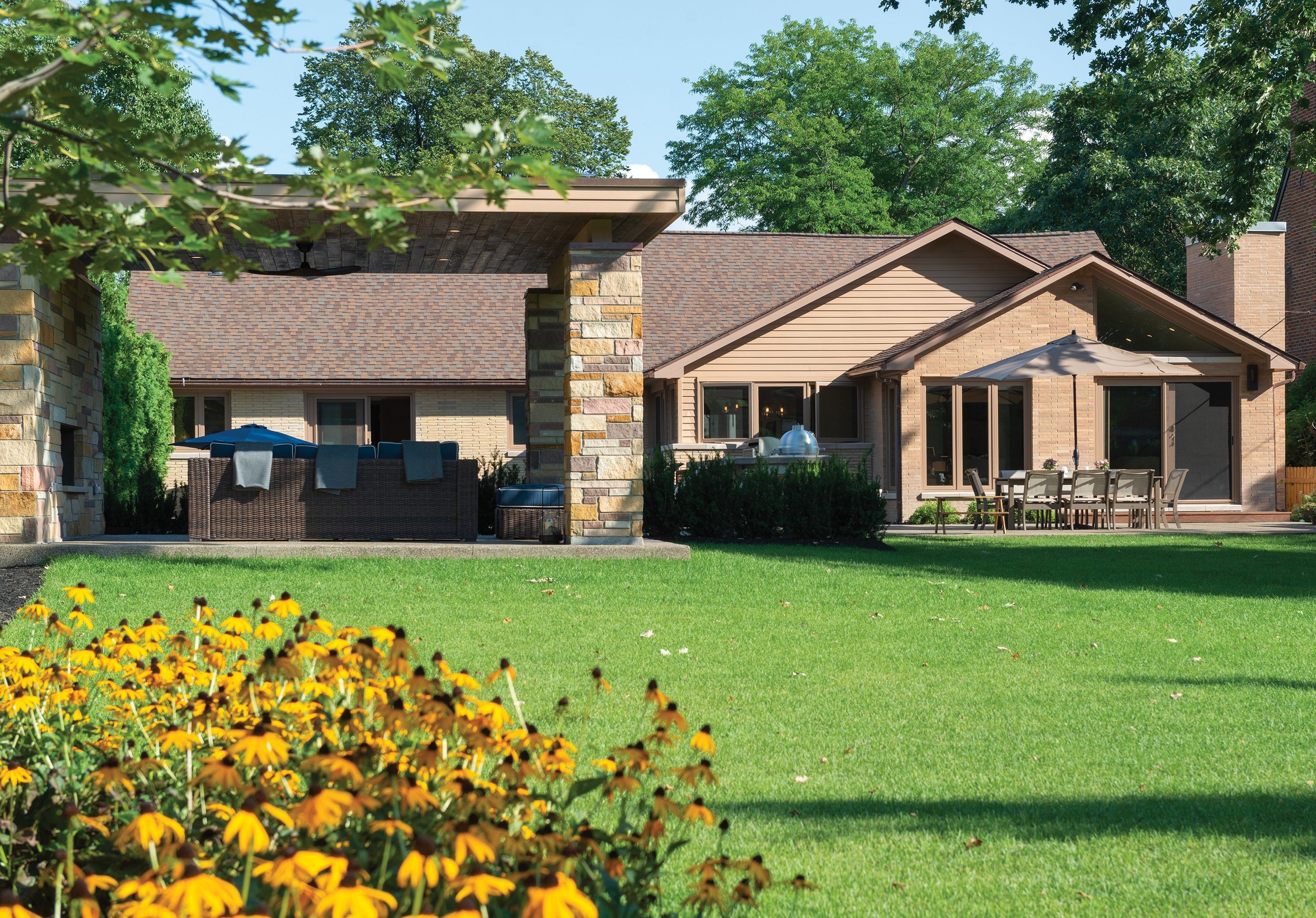
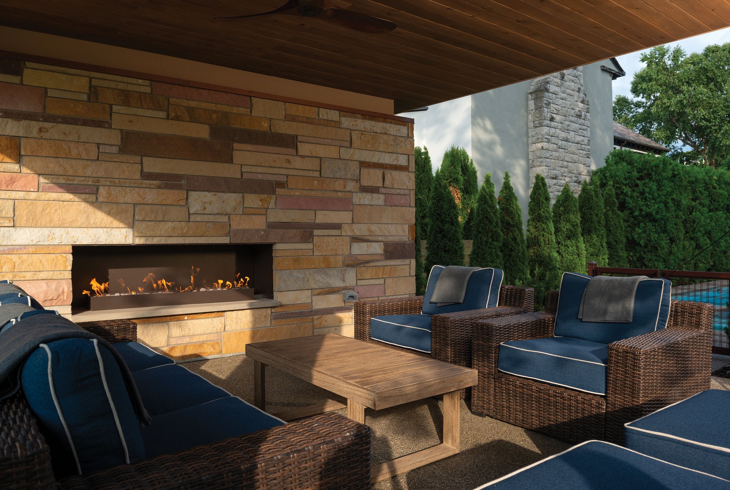
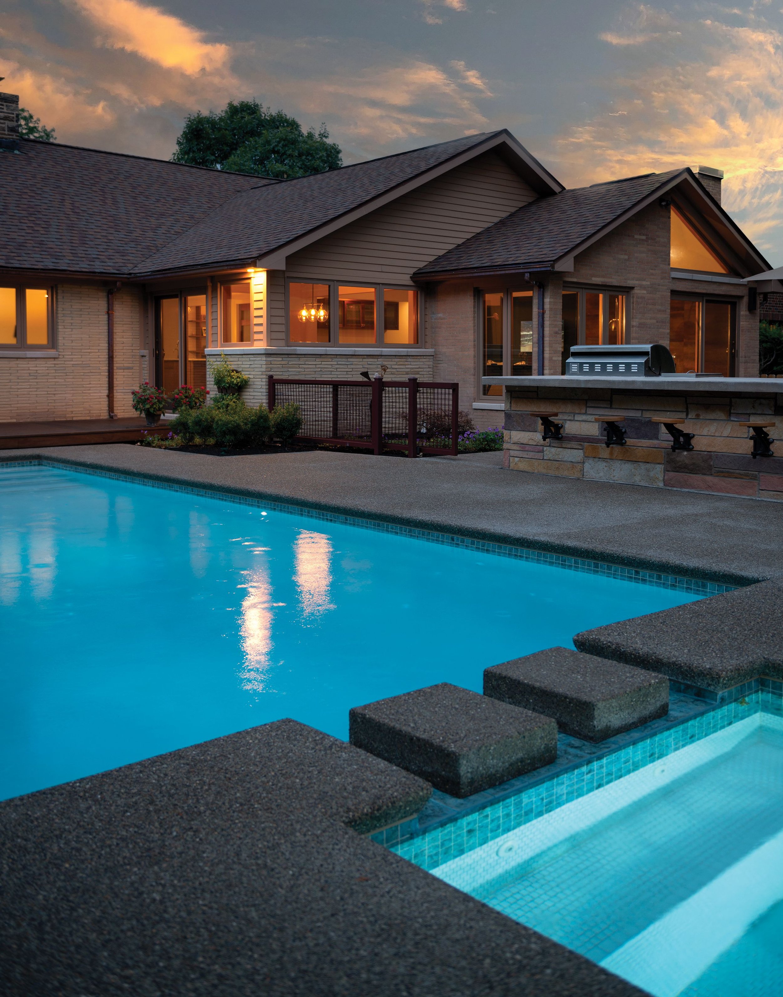
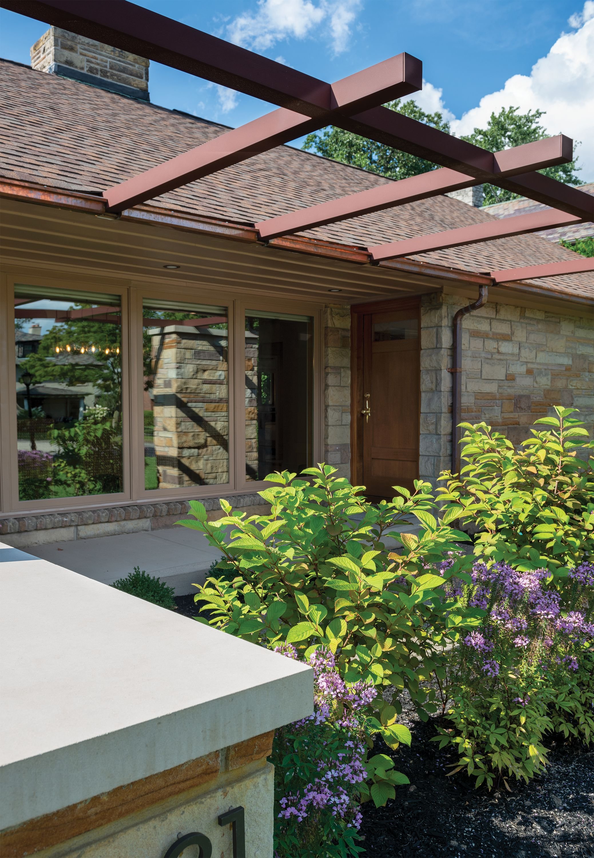
The exterior stone façade was carefully selected for its simplicity and honesty to the genre. It carries to the backyard pavilion and pool-centered patio. The pool also received a makeover, with concrete stepping blocks, which transformed it from a pool to more of a water feature adding balance and liquid beauty to the backyard. The clean-lined wood garage door also celebrates the style and color of mid-century wood trends. There is no expression of grandeur or showpiece flair; Bailey delivered understated, quiet elegance.
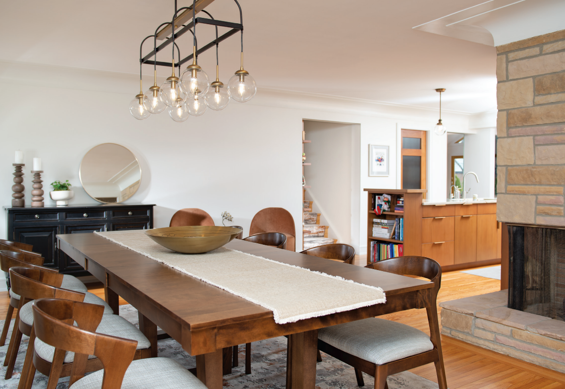
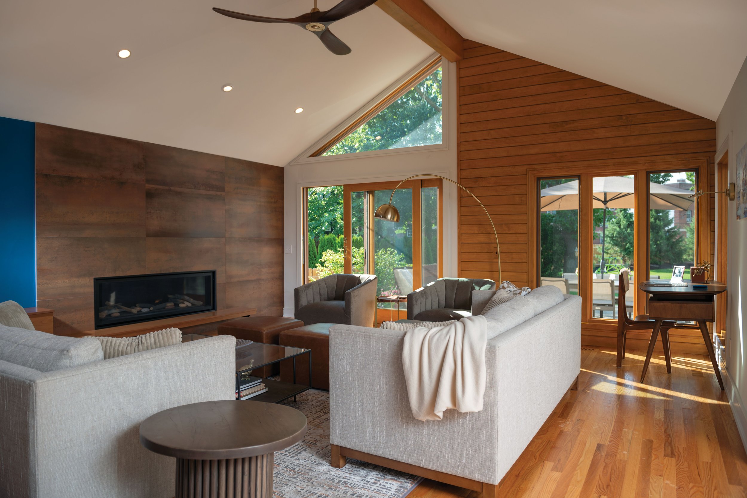
True to its personality, the mid-mod interior is not worn like a costume. It’s fresh and organic. Large, copper-like tiles establish a warm, earthy feature wall around the fireplace. Tony also put a lot of sweat equity into his home and installed exterior copper details.
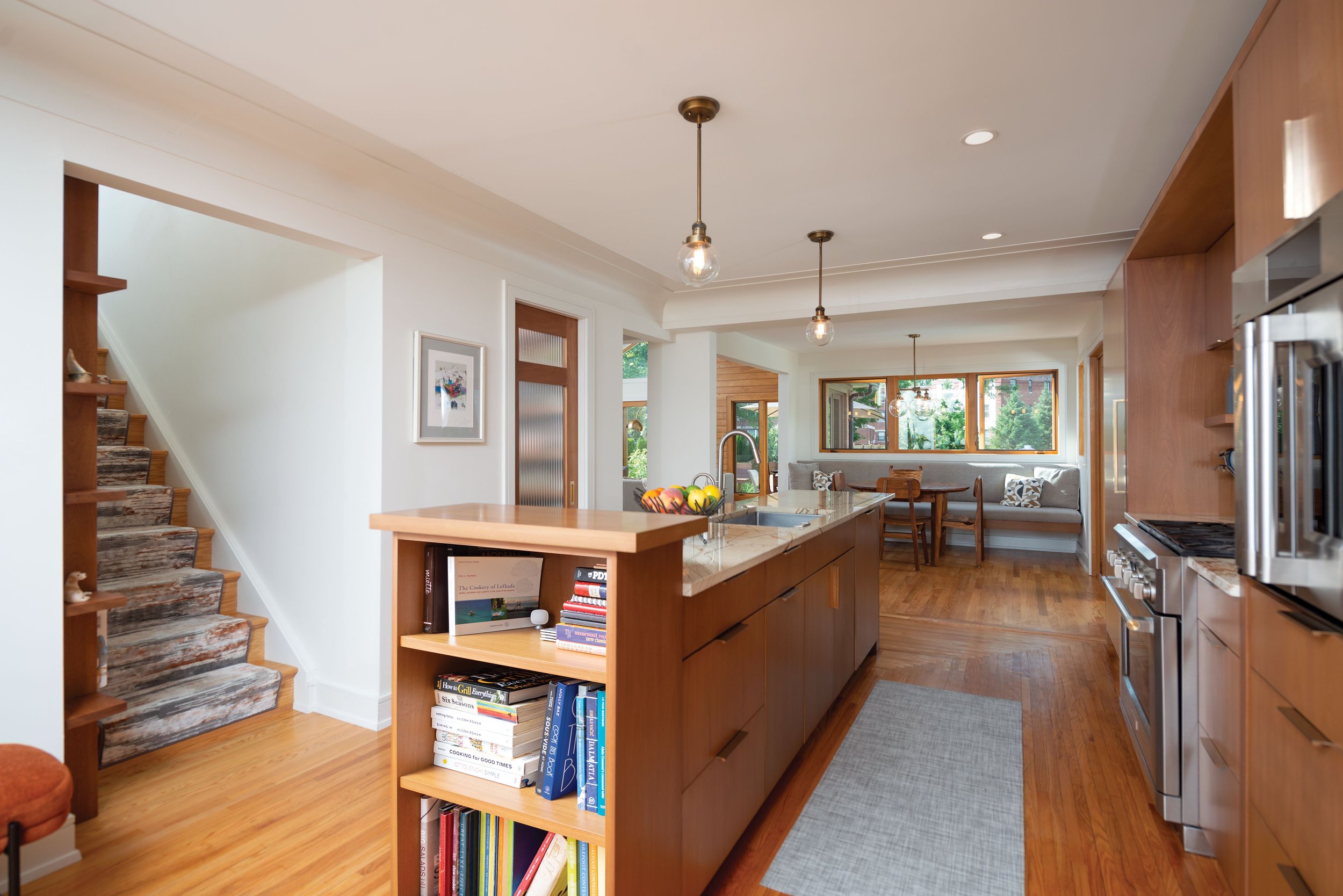
Because the kitchen is plunked into the very center of the open floor plan, careful details merge it with its surroundings. Caning on the Sapele wood island cabinetry adds texture. The large island is capped with a bookcase making it look more like built-in furniture rather than a kitchen workspace. The stone countertops carry a pattern reminiscent of twigs and fossils.
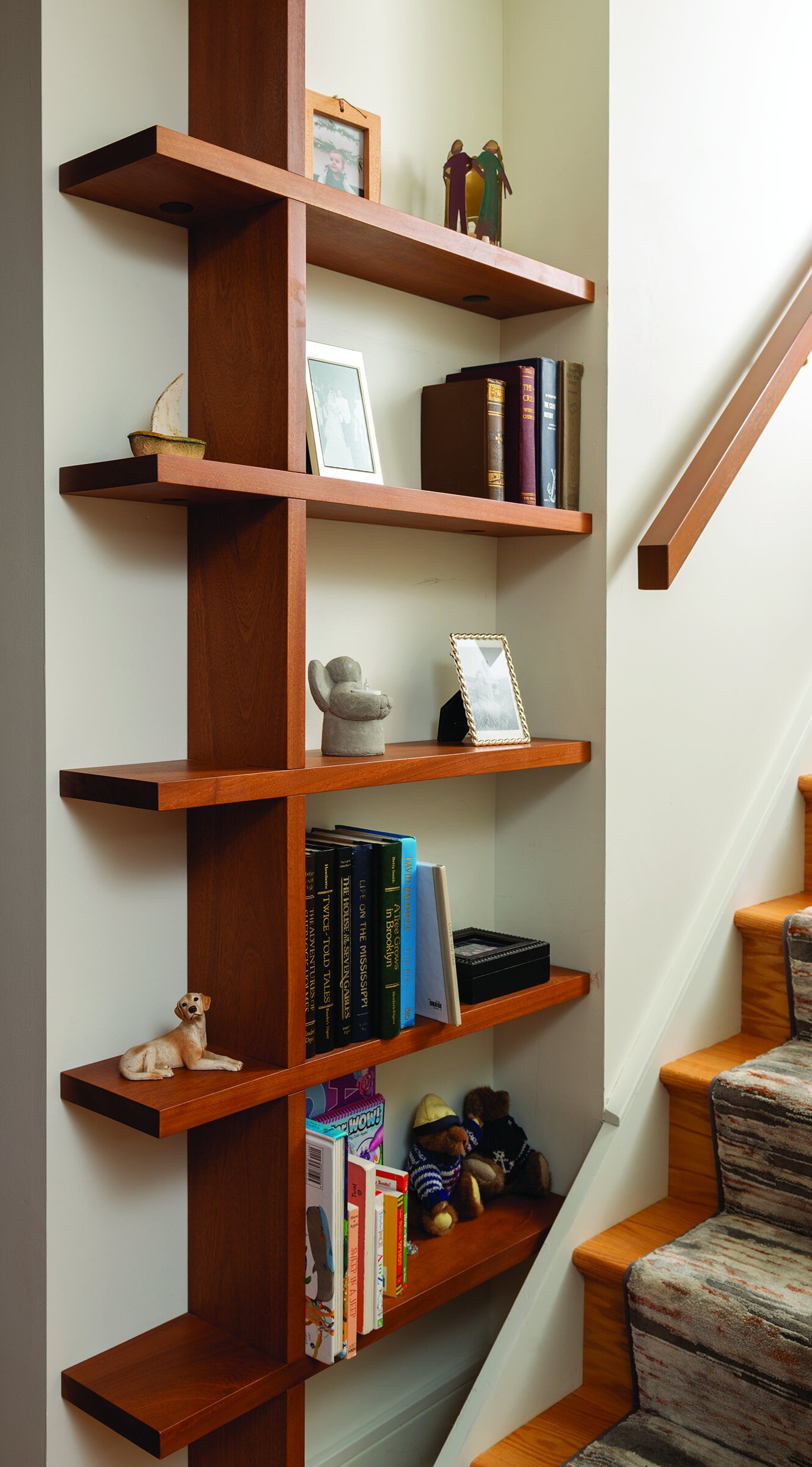
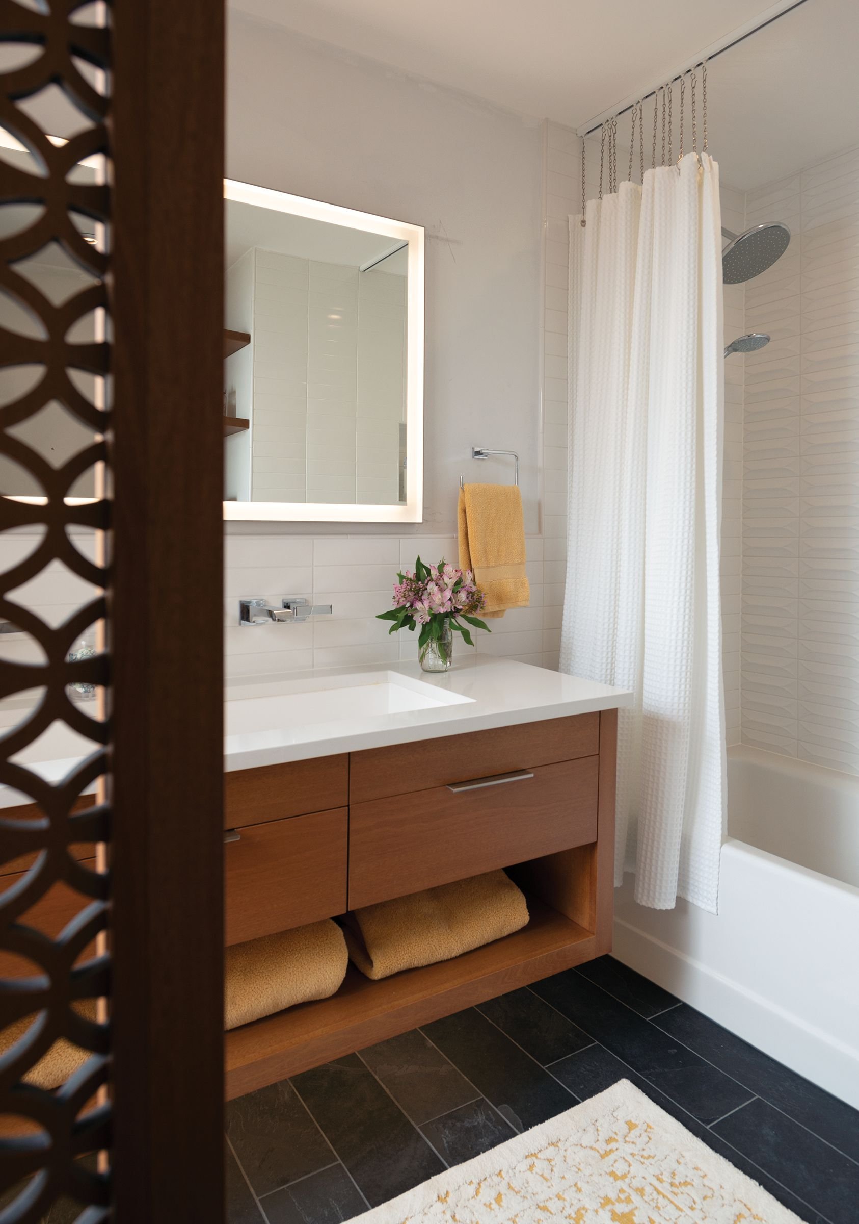
Aesthetic surprises are found throughout the home. An atomic front door doorknob adds tangible authenticity to the home’s aesthetic. Cantilevered built-in shelves, also in Sapele wood, bring clean mid-mod curves and lines to the stairs. A bathroom features a woodcut, privacy screen mimicking mid-century concrete breeze blocks.
Calm Waters
For Susan and Tony, the kitchen is a favorite spot as the center space for socializing. Susan also enjoys sitting out back with a fire in the fireplace during the wee dark hours of the night. “I enjoy that time of day,” Susan says. “It’s peaceful and private. I liked being on the boat during night watch with the stars and moon. It’s just beautiful.”


