A Time Traveler
Rip Van Winkle, the titular character in Washington Irving’s eponymic short story, falls asleep and wakes up 20 years later to a changed world.
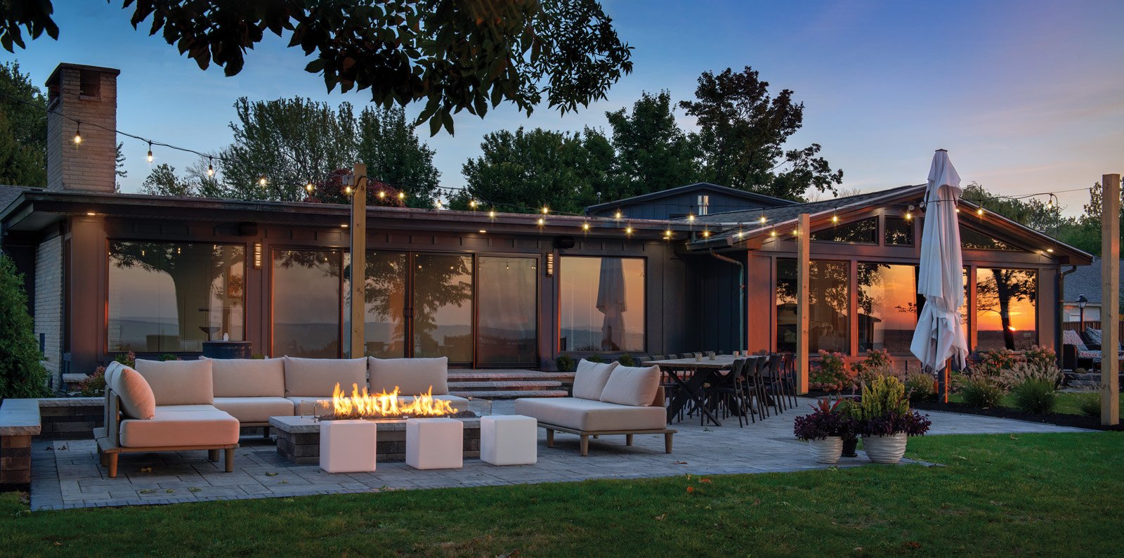
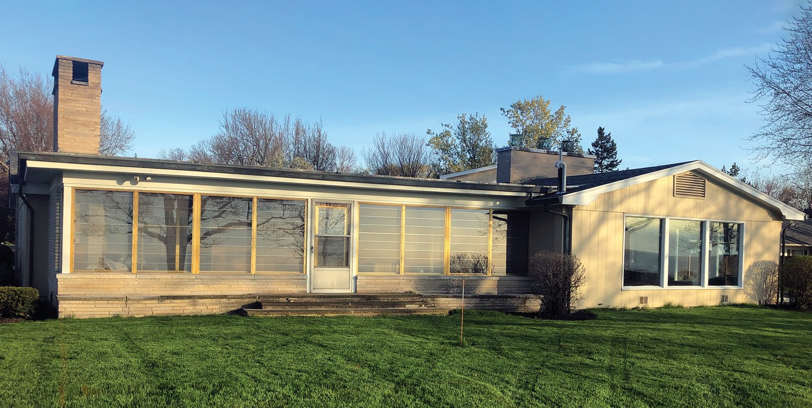
The same can be said for this lakefront home. Built in the late 1940s, it required a visionary remodel to rouse it from its long slumber.
Caroline Design owner and interior designer, Caroline Barr, recalls, “It smelled dingy. It looked dingy.”
Time Warp
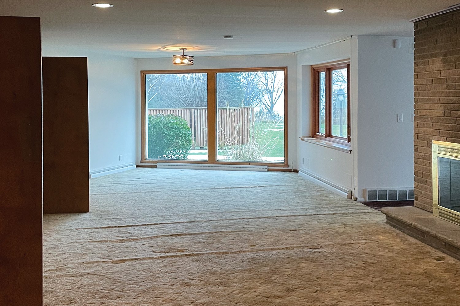
Built and designed to represent the architectural trends of its time, this mid-century house was built at a 45-degree angle to the water. The architect did design a stylish home. Unfortunately, the floorplan was oblivious to its spectacular Lake Ontario view.
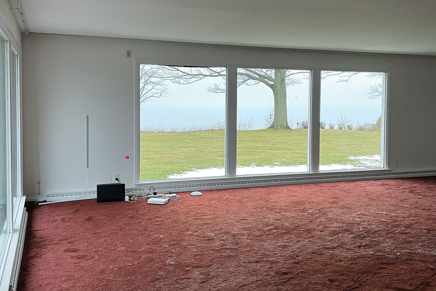
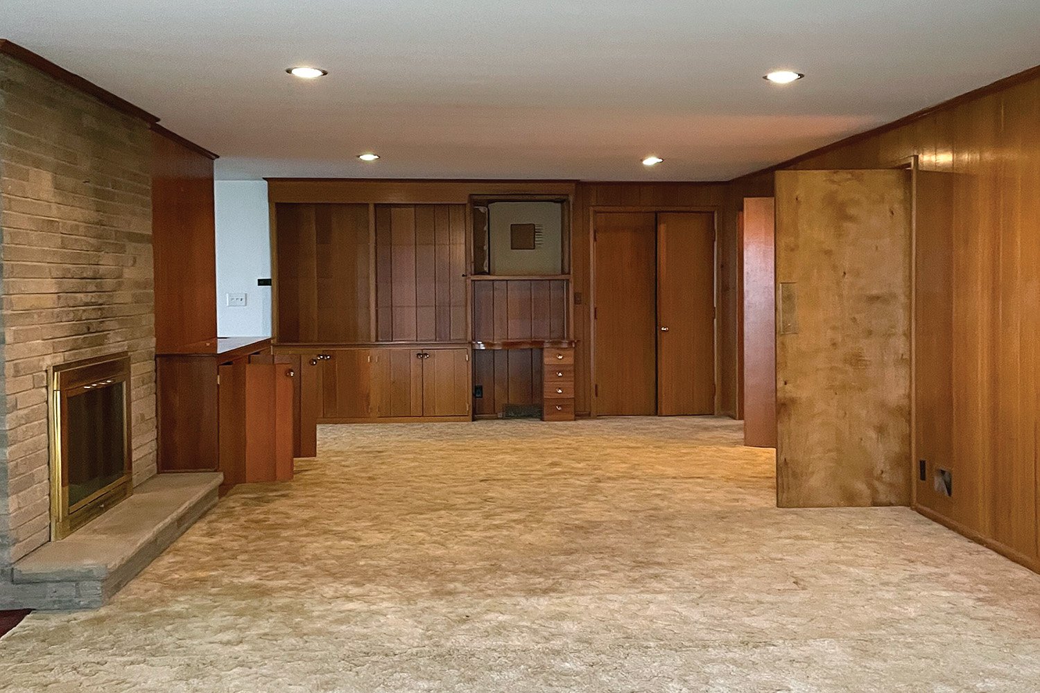
Like most lake homes, the back of the house faces the lake. The front was occupied by the kitchen adjacent to a sitting area with stairs (“dead space,” according to Barr) that led to the basement. In the normally coveted back portion, an oversized central brick fireplace anchored a vast living room, keeping spaces dark and broody. Flat ceilings, woodpaneled walls and wall-to-wall carpeting screamed grungy and old. A back-facing sunroom with a single door led outside.
Barr, who has a degree in interior architecture, decided there was only one way to wake the house up. Give it an architectural renovation capable of harmonizing indoor and outdoor spaces all without changing the original footprint. She brought in Funk Home Remodeling, Inc. as the builder to execute her design.
Interior Shape Shift
“You have to understand all possibilities,” Barr says. The first thing I’m thinking of is function and flow. Then get creative, all while focusing on the owners’ personalities and styles.” The homeowners embrace contemporary trends favoring open public spaces linking kitchen, dining and living areas.
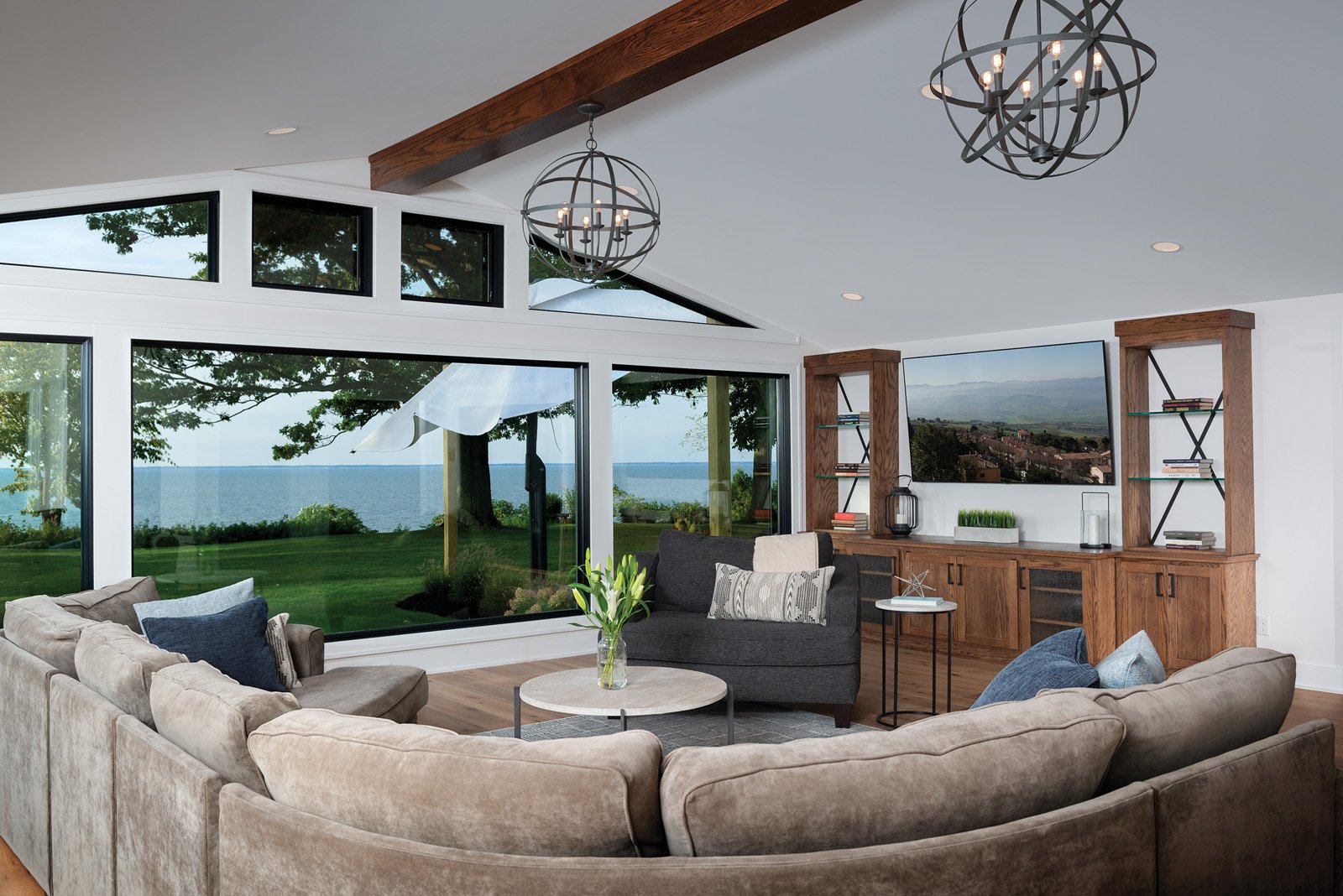
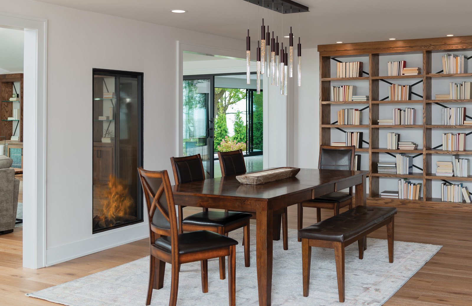
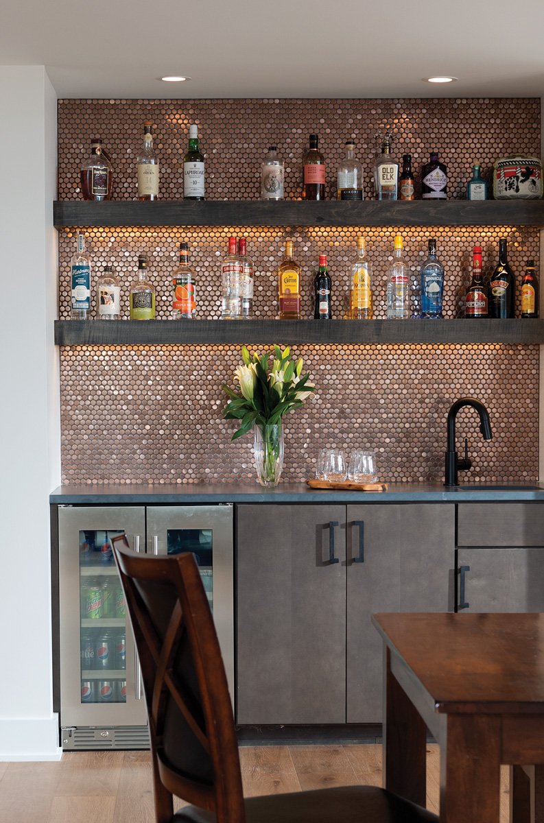
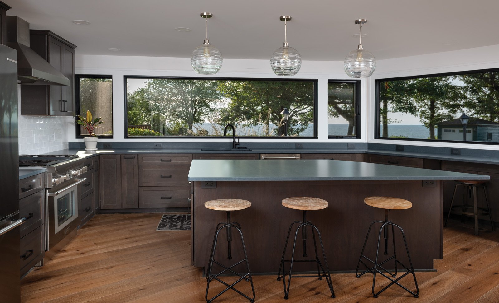
To achieve this, Barr removed the kitchen and replaced it with the basement stairwell and a butler pantry. The kitchen moved to the back space occupied by the former stairwell and a portion of the sitting area, angled to capture a gorgeous, aquatic vista. The remaining old sitting area is now the dining room. Meanwhile, the brick fireplace was removed and replaced with a fabulous, window-style version to increase light and views. Removing the living room’s flat ceiling revealed a vaulted one, to which Barr added an accent beam. A posh bar space livens everything up. The lake views take center stage with the addition of expansive new windows and doors throughout the home, bathing spaces in natural, fresh light. A mudroom now connects the garage to the kitchen for added lifestyle ease.
Aesthetic Challenge
With the functionality and flow nailed to perfection, attention shifted to interior selections, which presented a challenge. The husband loves castles while the wife prefers a contemporary style. Clean kitchen lines with maple cabinets and glass globe lighting keep the look lovely and simple. Leathered quartz countertops mimic timeworn soapstone. The dining space features a retro-futuristic chandelier.
Medieval allure appears in modern form as iron details in living and dining room bookcases, and kitchen island stools.
Bright and fresh are now the living room vibe, achieved with the vaulted ceiling, more windows, and the transparent fireplace. Iron lighting in caged globes contributes a subtle castle effect while penny tile behind the bar adds glittery indulgence. For fun, the husband’s office has two stone walls complete with faux moss.
Every space has a subtle, tasteful nod acknowledging the noble lake right outside. These include ceramic pot fountains on the back patio, blue gray colors in the mud room, and wave glass on pocket doors.
“For remodels, work with a designer architect who thinks of things you never thought possible,” Barr advises. “If you shut down possibilities with, ‘this can’t happen,’ you’re left with a box. The bones of this house are still there. Just moved around.”


