Delectable Design
APPRECIATING A HOME WHILE ENVISIONING SOMETHING DIFFERENT IS A FAMILIAR FEELING TO MANY HOMEBUYERS.
In the case of a newly purchased, beautiful, older home in Amherst, New York, renovating the kitchen was always part of the plan.
In addition to creating a kitchen that could support the new homeowner’s passion for cooking, redesigning and reconfiguring the space would improve its flow and functionality within the home. It also gave the homeowners an opportunity to infuse their own style and give their house a beautiful, fresh new chapter while enhancing its gorgeous old bones.
“The homeowners were very hands-on,” explains Eric Naish, Residential Project Manager, for R.E. McNamara, the design build firm hired to execute the transformation.
Less Is More
The original layout had two doors going into the formal dining room, located behind the range wall. It made for pleasing symmetry, but the homeowners only ever used one door, rendering the other door vacant space.
“Having two doors limits what you can use for high-functioning kitchen items,” Eric says. “Addressing that helped us with the layout.”
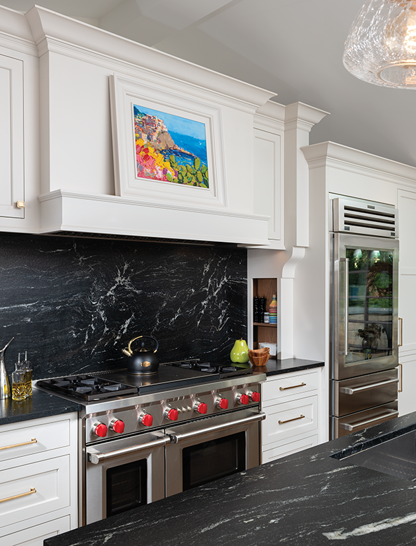
As a remedy, one doorway was enlarged, and the other walled off. The fridge was installed in its place. It’s now a spectacular feature wall highlighting the range with a hidden hood piece. Stately pilasters with integrated storage bring grace and style,
beckoning the homeowners to cook. A single colorful painting resides over the stove. The painting is special to the homeowners and the hood was designed to showcasethe artwork.
Island Time
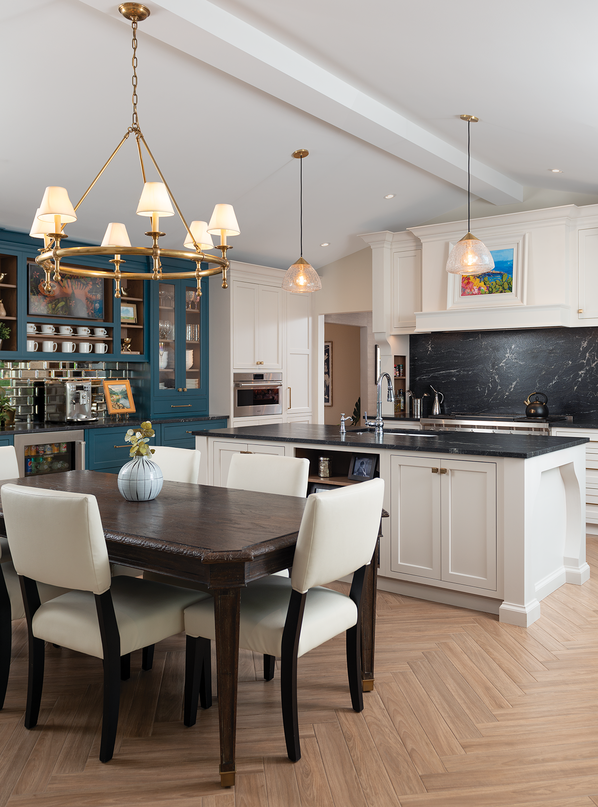
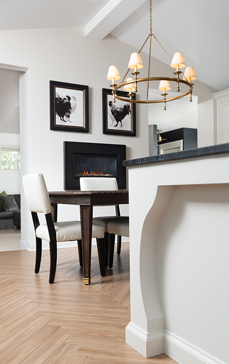
The island occupies a maximum footprint while still maintaining clearance space. The homeowner envisioned a curvy leg detail. The “leg” is sculpted out of the island, creating elegance out of negative space. The counters and backsplash are leathered granite, softening the crisp black and white contrast with traditional features.
TASTEFUL STATEMENTS
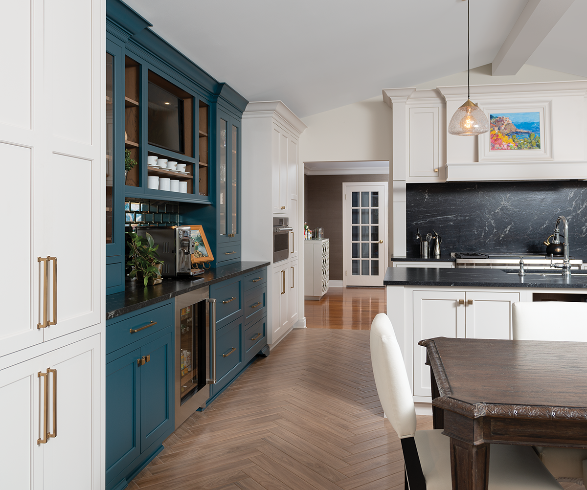
The homeowners also wanted a spectacular beverage bar. Painted a moody blue, the masterful space makes itself known with intentional, dramatic details that set it apart from the cooking zone. Mugs are intentionally placed, and mirror-like subway tile introduces an edgy detail. Undercounter beverage drawers are integrated with cabinet panels.
Not to be outdone, the heated floor balances demure tradition and bold intentions with an oversized herringbone pattern. Look closely. Inside the coffee bar and interior portions of the island’s open storage (positioned opposite the range) are oak-stained to match the floor.
Beaming With Style
Part of the kitchen’s appeal comes from the quiet details. The original ceiling was vaulted, but the cabinets did not take advantage of the space. In this new iteration, cabinets extend to the top with large crown molding, which makes the kitchen feel taller. A new beam along the vaulted portion elongates the kitchen and orients it along an axis. The beam also provides a place to mount the chandelier.
In a way, the kitchen moves along a gradient with a cooking, work zone on one end to a relaxing, cozy space on the other. The beverage bar is along the side. Large windows flood the space with natural light.
Aesthetically pleasing and a functional powerhouse, the kitchen embodies a commercial-grade workspace dressed in classic elements with a contemporary twist. It’s a space made to give the homeowners timeless design whose appeal is likely matched only by the food and company.


