Cooking Up A True Original
IT SOUNDED STRAIGHTFORWARD. TAKE A 1930s TUDOR REVIVAL COTTAGE AND RECONFIGURE THE SMALL, SEPARATED DOWNSTAIRS KITCHEN, DINING ROOM/PLAYROOM, AND LIVING ROOM FOR A MORE SPACIOUS AND PRACTICAL DESIGN.
The challenge? Working within the offset, staggered footprint of the original rooms. The project became an exercise of visual trigonometry, linking disjointed walls into a gorgeous, cohesive, high-functioning space that looks like it’s always been part of the home.
The Right Fit
“It’s a weird space and complicated,” says homeowner, Amanda Whitford, “I wanted to keep the character and uniqueness.”
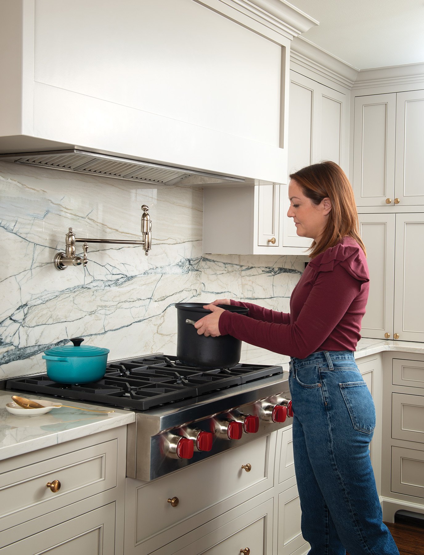
For Amanda, that meant finding the right balance between subtle separation between the spaces and simultaneously establishing an open, connected feel. It also had to be highly functional. Amanda loves to cook and bake and wanted to enjoy her daughter’s company while each did their own thing.
Amanda enlisted Shop Dog Studios to find a creative solution. In addition to being a general contracting company, Shop Dog is a custom cabinetry shop that does its own design work. It was the perfect fit. “We’re a combination of dedicated specialists and a shared knowledge base,” explains Shop Dog owner, Kyle Fricke.
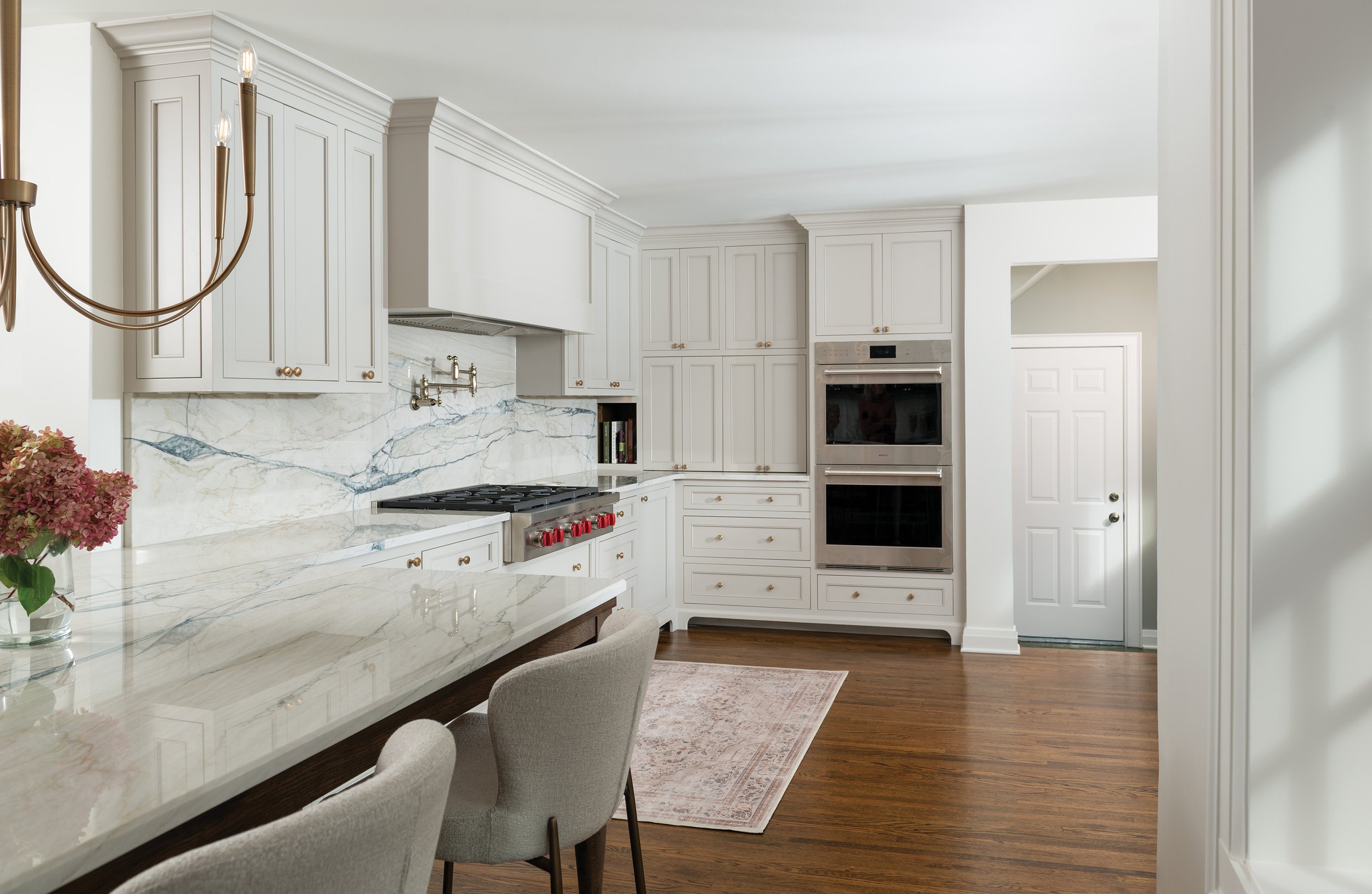
That pool of experience led to a clever solution. The original living room had two arched doorways, one leading to the dining room/playroom and the other into the kitchen. Reconstructing the space by removing walls opened the living room to a kitchen and new eating nook. A large peninsula provides a place to dine and do activities such as crafts and homework. That peninsula was a Shop Dog stroke of genius.
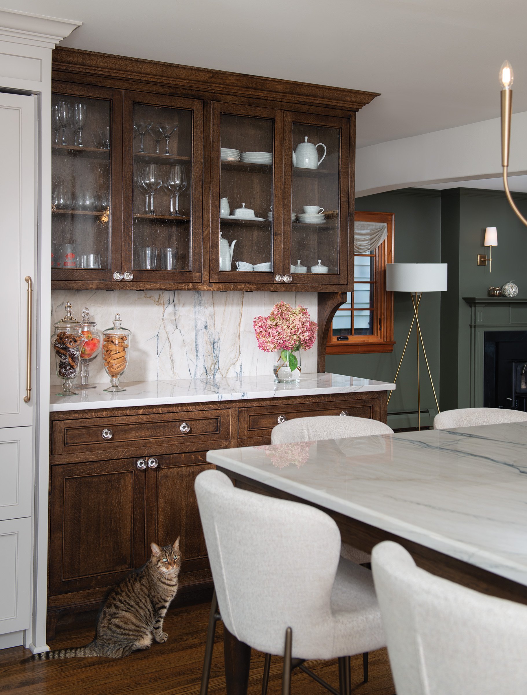
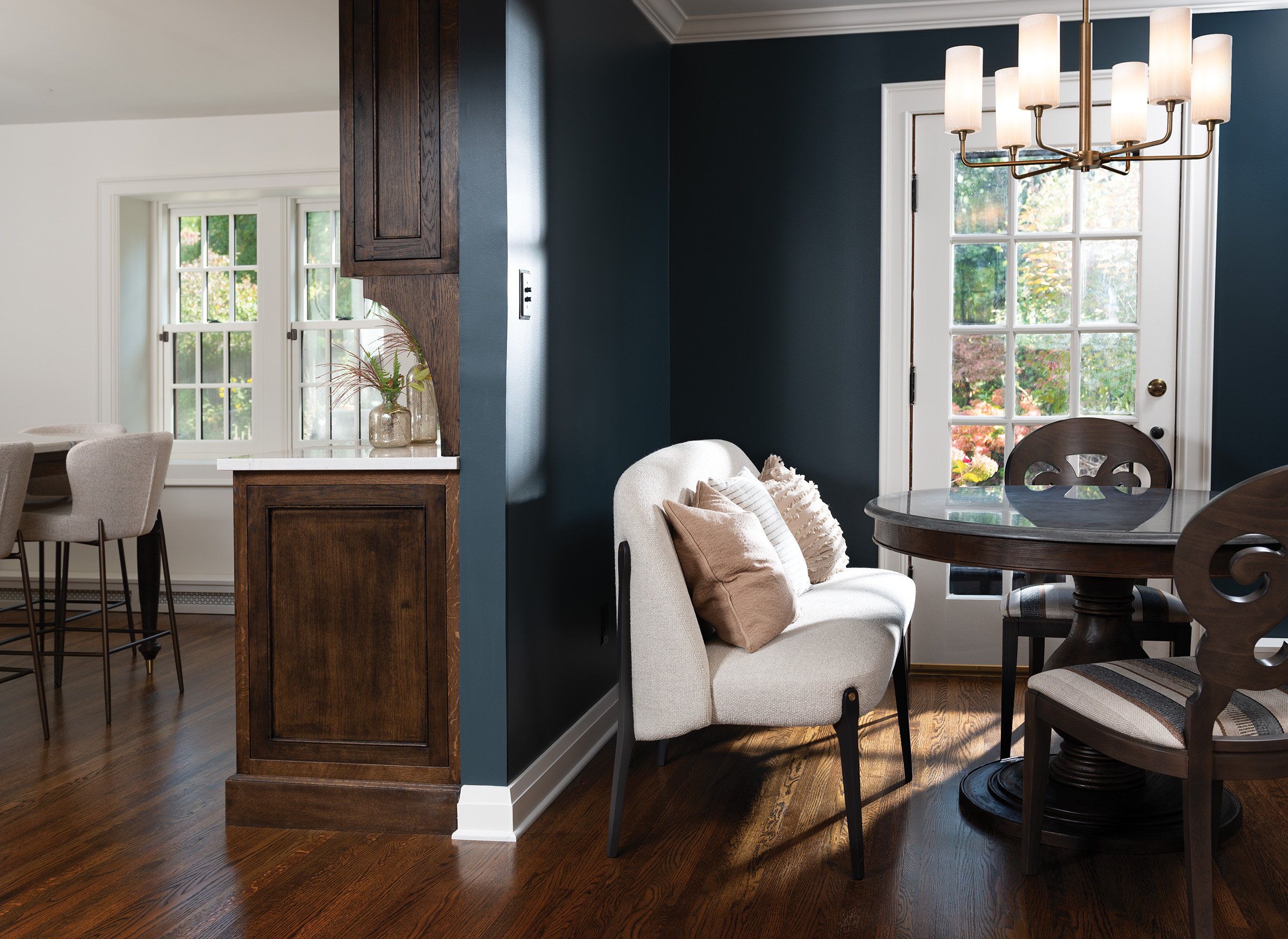
Kitchen islands are a typical go-to solution for eating, activities, and additional counterspace. But after accounting for walkway patterns, there was no room for a kitchen island. The peninsula elongates the kitchen, bringing it together with the eating nook despite the pronounced floorplan stagger. The offset space is filled with a custom-built cabinet masquerading as a hutch.
Style Points
When looking at the space, one feels an organic, cohesive flow — the result of craftsmanship
coupled with many purposeful design details. The “hutch” looks like a piece of furniture. Different hardware sets it apart and it’s the only built-in cabinet with a custom stain of chocolate brown topped with one coat of black. The hardwood floor is stained the same brown, minus the black.
For the peninsula, brass peg legs translate as a dining room table.
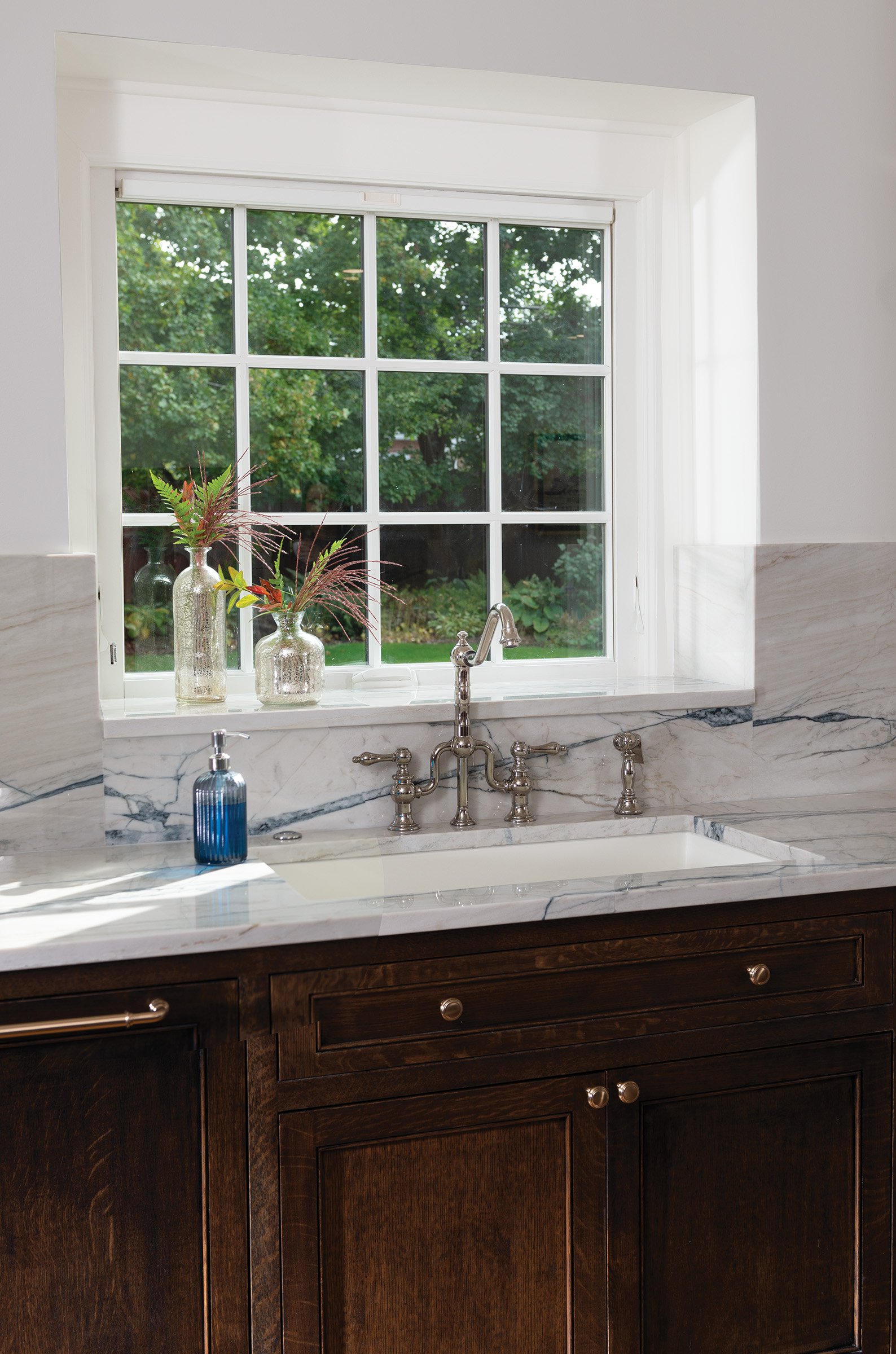
Nearby, the entry to the living room is now a wide-open space with a graceful arch, a nod to the architectural detail of the two original doorways. The organic curvature is also present in the counter toe kicks. A fun splash of blue veining throughout the quartz countertops and hutch backsplash balances traditional attributes with fresh, contemporary flair. Moody paint hues pull it all together.
Amanda points out that Kyle originally went to art school. “He says he pulled out all his art school stops to make this happen,” she says. “I can’t say enough good things about this project, it was a wonderful experience.”


