Timeless White
For several years prior to the current fashion of using deeper colors in the kitchen, the red-hot trend of snowy white kitchens dominated the interior design world. Long before white kitchens became the toast of the town, Leslie Cordaro, homeowner and interior designer with Design Associates, showed everyone how a white interior color palette throughout the kitchen, in fact, the entire home, transcends a fleeting fad to be both enduring and spectacular.
Complementing Contrasts
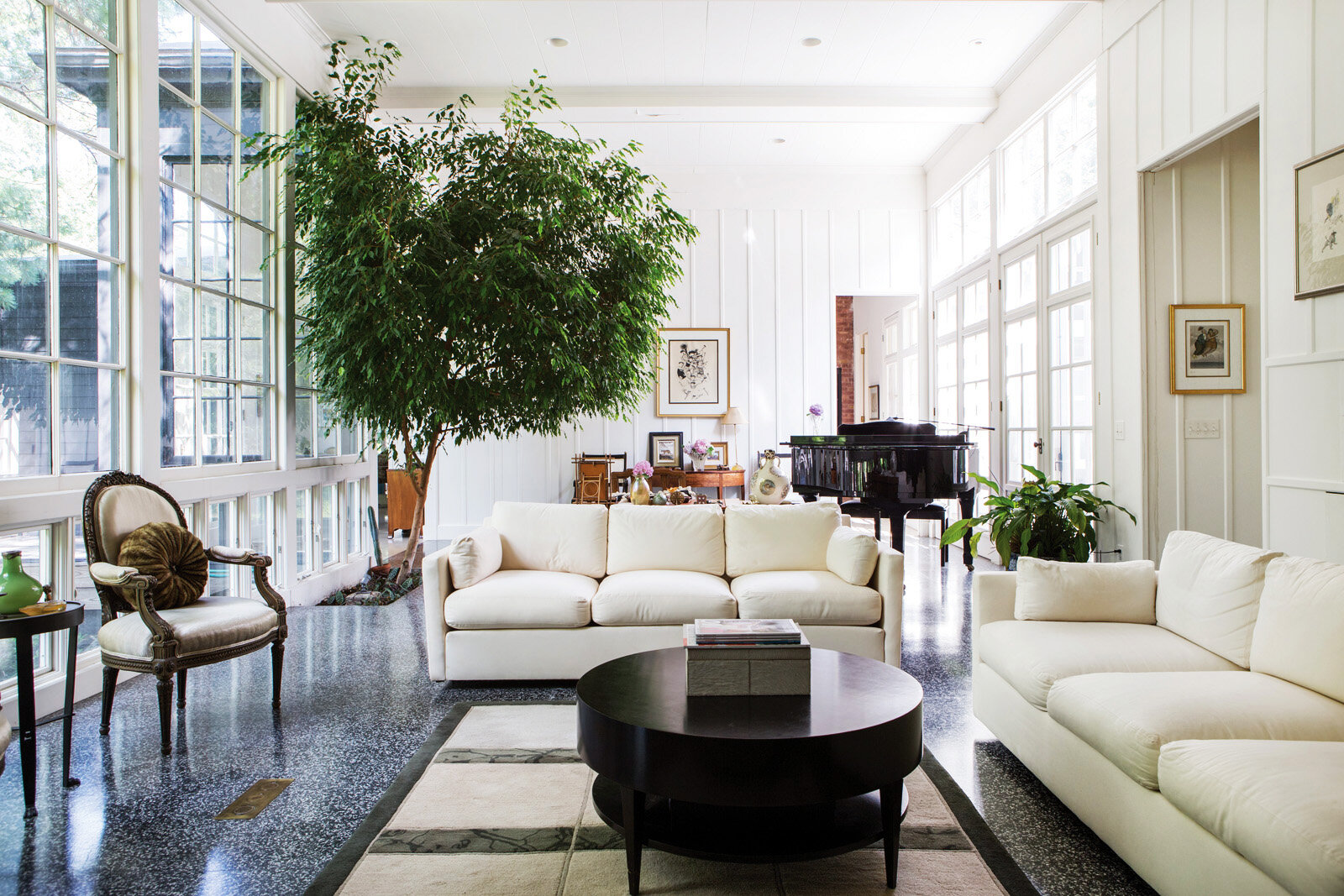
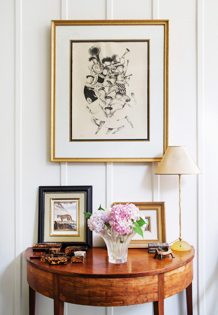
Cordaro purchased her home in 1995 and gravitated to white for the original color scheme. “I chose a very warm white because I have a lot of art and wanted to emphasize the artwork,” she says.
Built in 1952 by architect Cyril Tucker, the mid-century modern Rochester, New York residence was scaled for a wheelchair to move easily and freely through the entire home. With 18-foot ceilings and 10-foot French doors throughout, the proportions are airy, open, and flooded with natural light, due to the oversized windows that dominate the exterior. The single-story ranch wraps in a U-shape around a deck to the back deck and pool area.
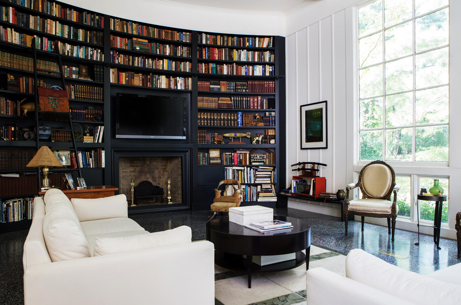
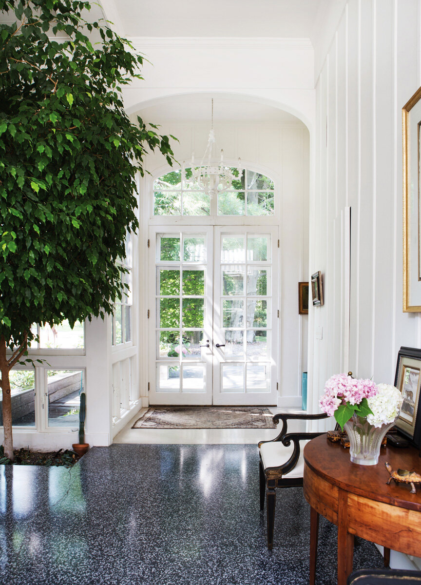
Cordaro’s design choices established a clean and minimalist interior punctuated with organic and classical features. A built-in bar is hidden behind a hinged, flip-down panel embedded in a sleek white wall. Traditional components are accentuated by the unfussy, sleek design. Likewise, the simplicity of white is appreciated more in contrast to the conventional elements. Terrazzo floors — a different design in each room — add European flair. The floor-to-ceiling black, curved bookshelf, complete with a sliding ladder and stuffed with literature, provides a soothing touch with a hint of antiquity. A ficus tree grows from the ground inside, near the entry.
“I lived in that home for 24 years and that tree has been there since I moved in. The roots go below,” says Cordaro.
Kitchen Reversal
When Cordaro moved in, the kitchen had black cabinets underscored with a rust and black speckled Terrazzo floor. To Cordaro, it felt like a separate entity. About 12 years ago she made dramatic change.
“I did the reverse!” exclaims Cordaro. “The skylights that come into the kitchen made it perfect. The kitchen looked cool black, but I like it better in white.”
Concept II Kitchen & Bath helmed the project with Cordaro as the interior designer and was responsible for creating a kitchen remodel that unified the home’s distinct design.
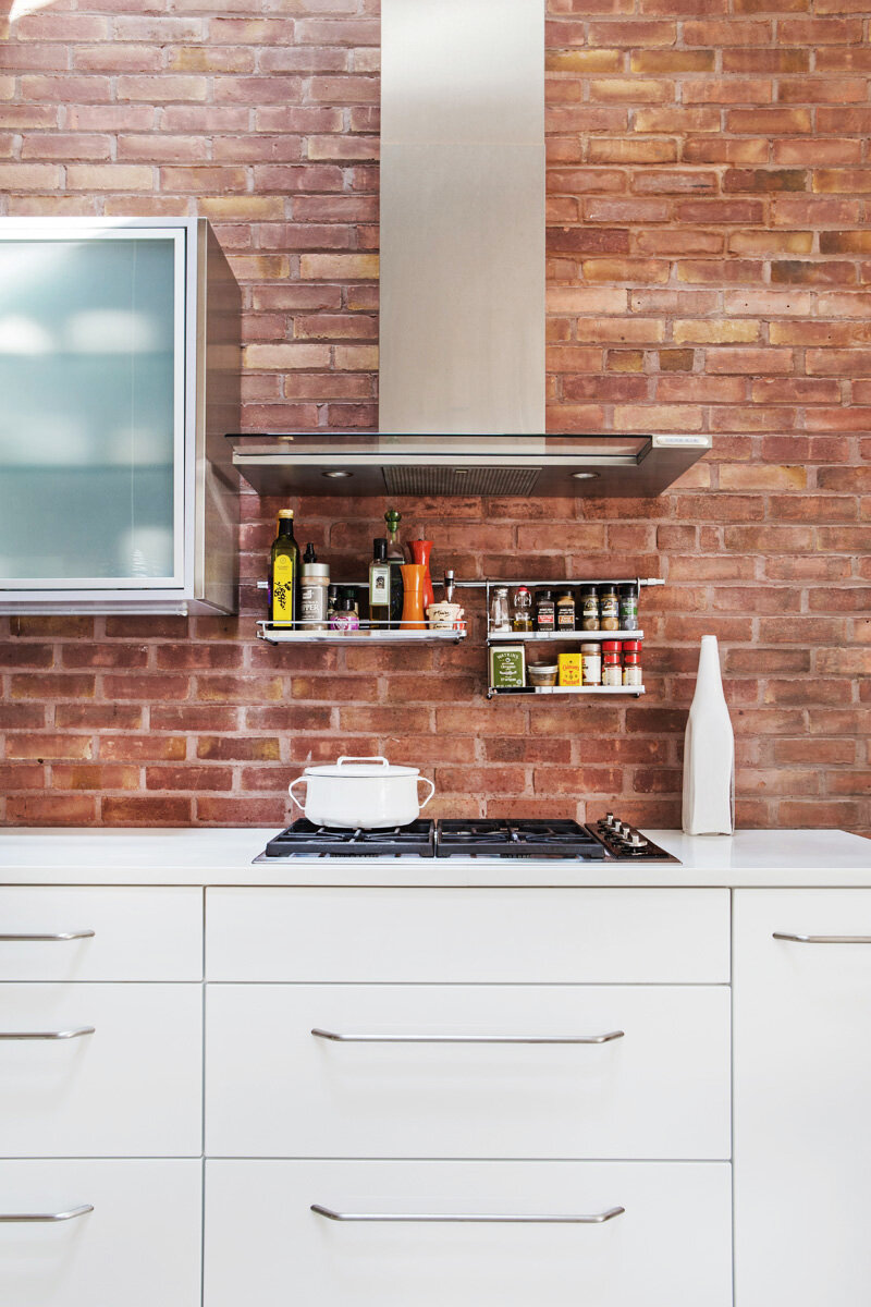
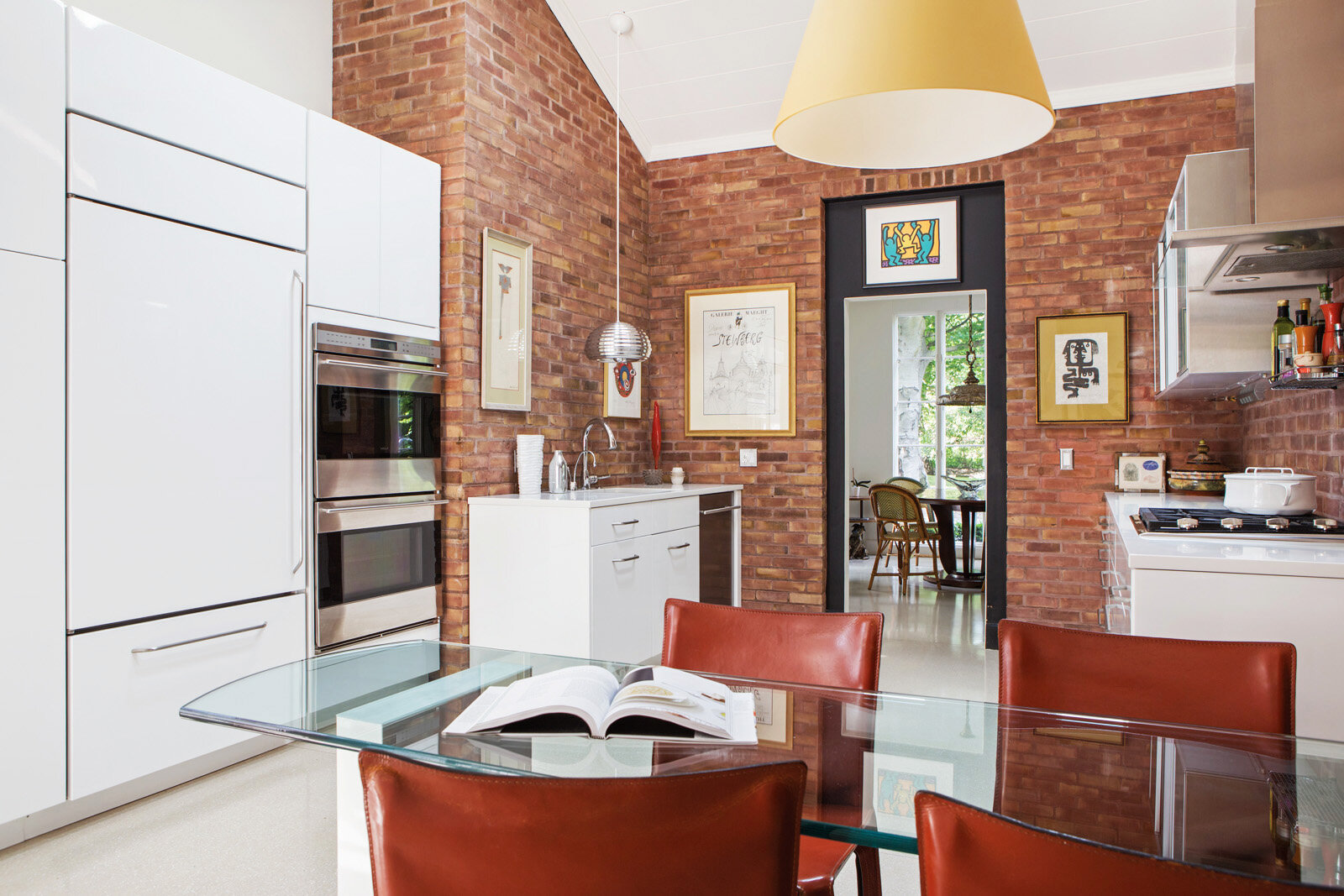
A wall of slick, white lacquered cabinets integrated with high-end appliances are balanced with another wall of mixed cabinets of stainless steel and glass uppers, and white lacquered below. The white wall of cabinets hides the microwave. The Terrazzo floor is a creamy white. The doorway is trimmed in black. A futuristic stainless steel pendant light completes the look.
True to the home’s unexpected built-in features, the glass kitchen table is held up by a built-in pedestal base. Originally made of brick, Concept II wrapped it in Caesarstone. With such a great table, Cordaro saw no need to crowd the kitchen with an island.
A spectacular wall of unadulterated red loft brick brings an unexpected, earthy organic touch in much the same way the bookshelf serves the living room. The contrast of aged and modern features deepens the attributes of one another.
“This house flows very much how its occupants would want to live in it.An open great room doesn’t make sense for this house,” says Cordaro.
“It’s a spectacular home.”

