A Home Haven Renovation
In a busy world, few things are as Restorative as
a burst of fresh air awash With serenity and calm.
It’s a sensation associated with walking in a springtime forest or along a glittering shoreline. But inside a house? One built in 1973, no less? It’s time to discover how a 1970s Rochester colonial went from dated and drab to an oasis of simplicity and tranquility wrapped in high style.
Step Back in Time
The original home was a true representative of its decade. Compartmentalized rooms, narrow, strip plank, oak flooring, and slate tile in the foyer made the house feel cold and mundane. The upstairs had four bedrooms and two bathrooms; and downstairs, a main level with family and dining rooms plus a kitchen, and a classic 1970s basement featuring wood-paneled walls and a quasi-drop ceiling.
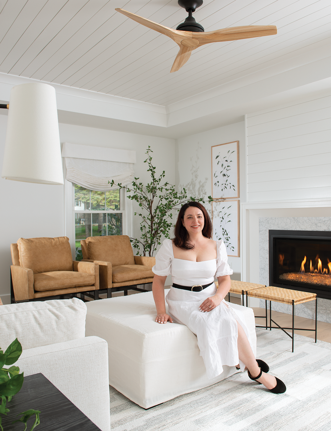
The homeowners, working professionals with two dogs, gave Danielle Barnes, principal designer with DMB Interior Design-Build, full creative freedom to transform their dated dwelling into an airy and bright oasis. Because of the dogs, everything had to be washable, cleanable, and scrubbable with performance- based fabrics.
Barnes delivered exquisite style composed of equal parts elegance and simplicity. Spaces evoke a crisp lightness balanced with reassuring warmth. It’s a place where a person, depending on their mood, can be soothed, invigorated, or find simple comfort. Sound like alchemy? Here’s how it was done.
Perfection Delivered
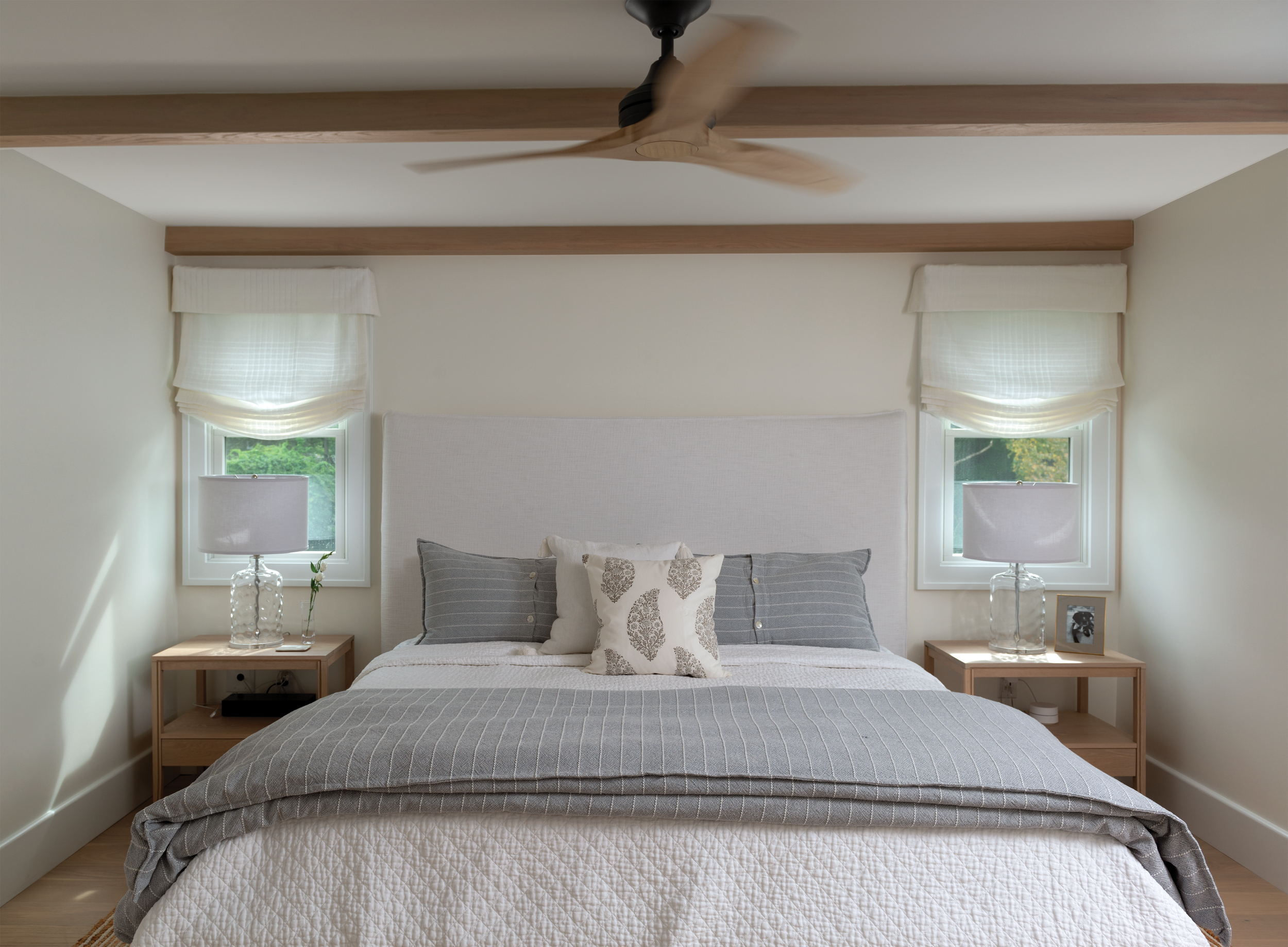
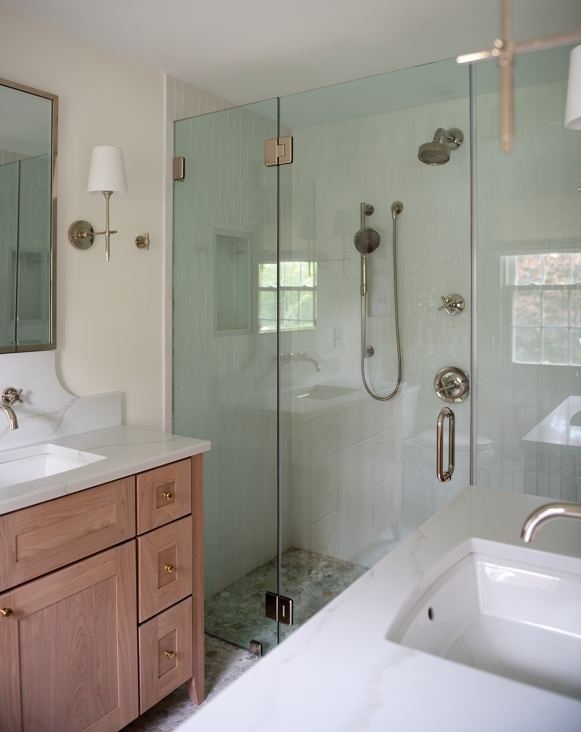
To accommodate a contemporary lifestyle, the upstairs floor plan was reconfigured into three bedrooms and two baths. The extra space went to a large primary suite with walk-in closets and a bathroom with a walk-in shower and two vanities. On the main level, the doorway between the living and dining areas was widened. The basement’s new layout holds a media area and home office.
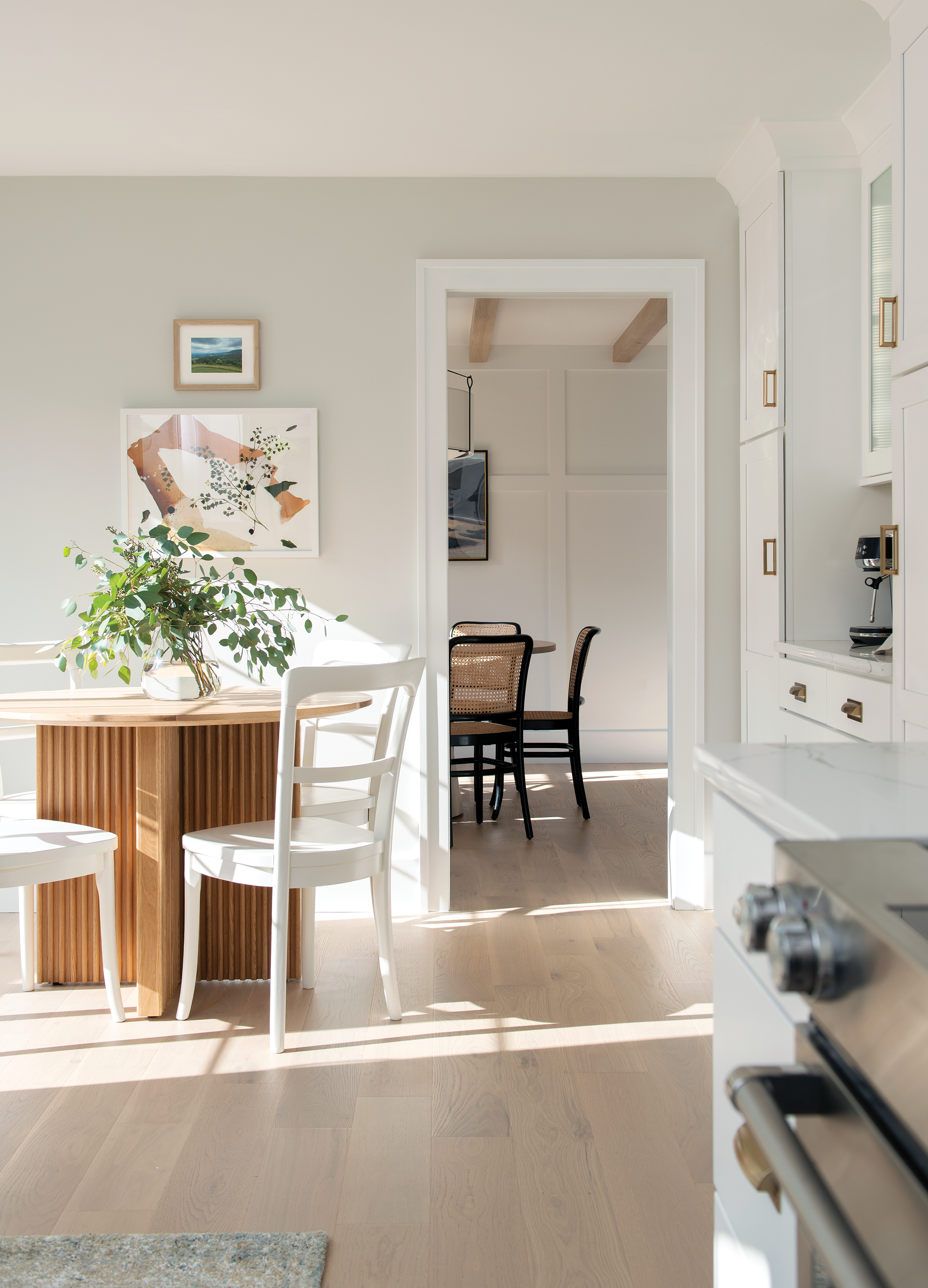
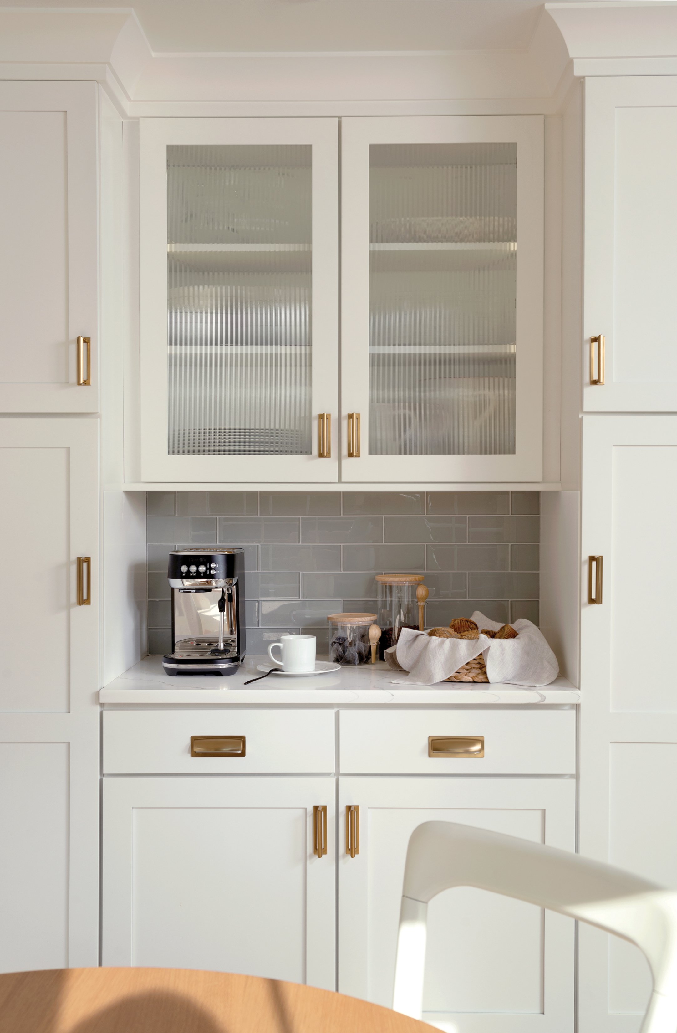
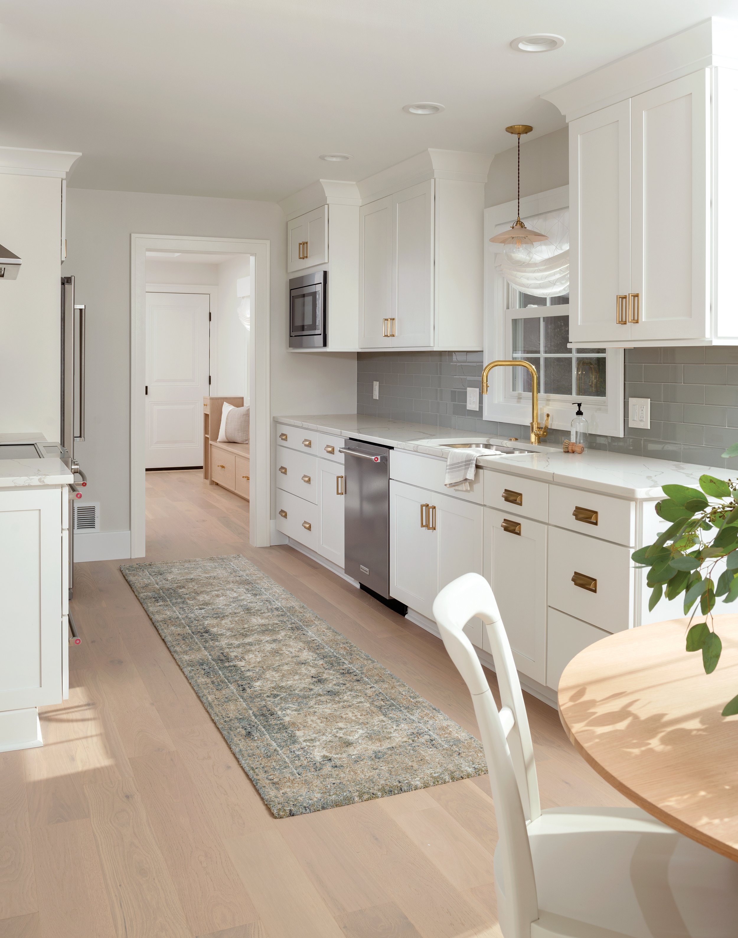
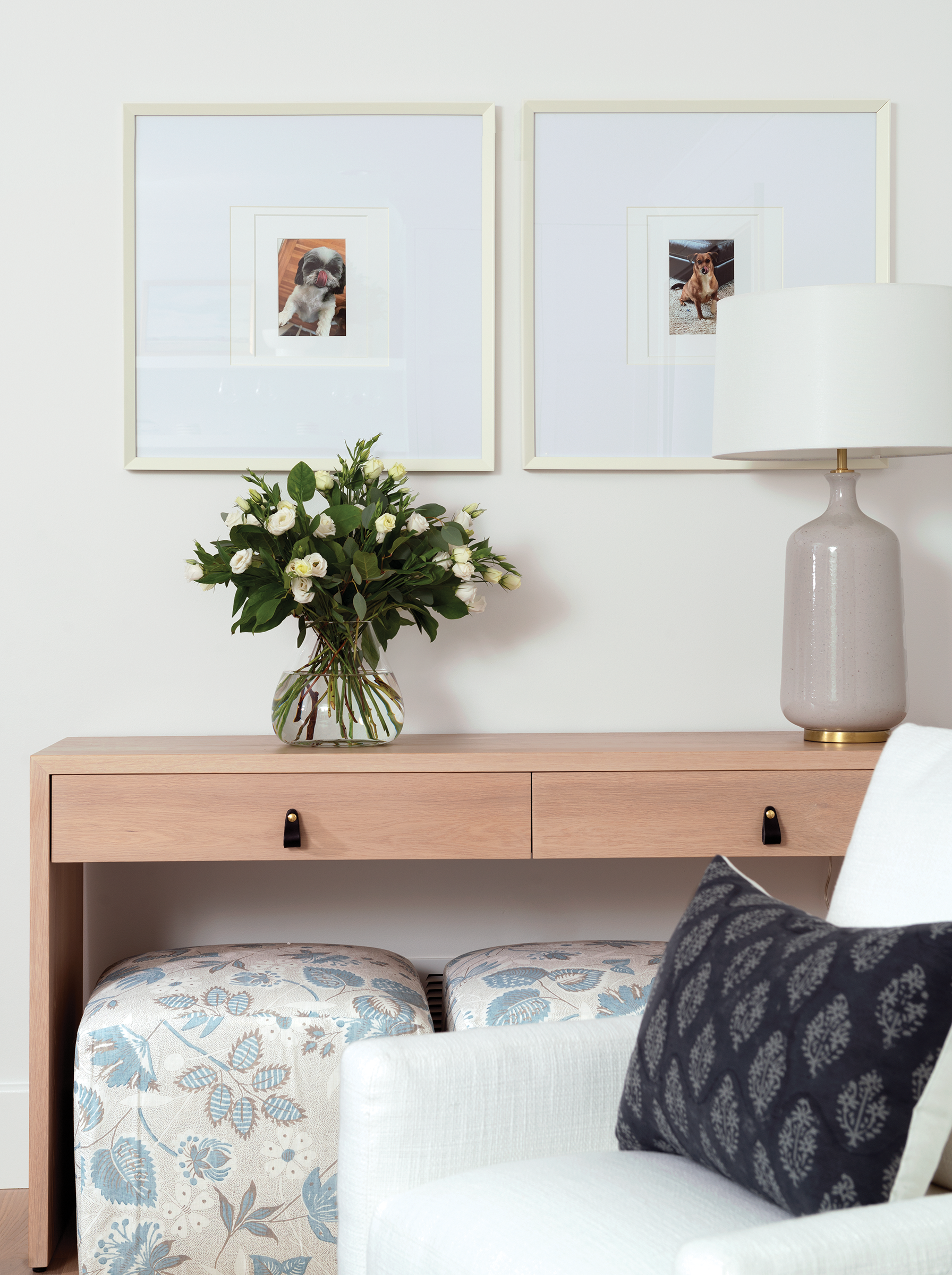
With its clean lines and a palette of whites against pale wood features, the unifying theme hints of Scandinavian influences. All exposed natural wood is white oak in varying, but similar, shades. Custom hand-crafted pieces emphasize consistency from room to room. The circular, white oak dining table with fluted crossed panels, console and side tables, and mudroom benches were all made in Rochester. Clear glass details such as in the shower and fluted kitchen cabinets, along with gold kitchen hardware, add a demure, yet sparkling touch. Distinct elements, both in architecture and furniture, further animate the design.
Style Strategy
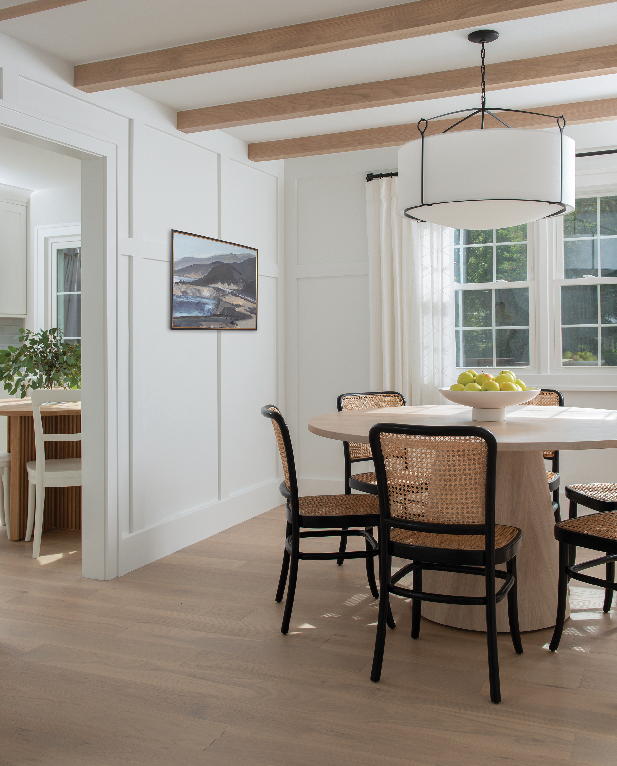
The dining area is anchored with highly stylized board and batten walls. The inclusion of a horizontal board turns the windowpanes and walls into complementary features, which expand the space visually. Overhead beams add the appeal of solid, timeless timber. Similar beams also appear in the primary bedroom.
The timbers play another role: they add shape and texture. Caned dining room chairs layer the effect with an engaging pattern and additional organic material. Grace and elegance come from the geometric table whose colors mirror those in the ceiling. The absence of a rug is intentional.
“When you design a neutral room, texture on texture adds depth and interest,” Barnes says. “The caned chairs are purposeful. The color matches the oak beams.”
Barnes raised the family room ceiling and created a tray style. Shiplap walls and ceiling contribute long, clean lines. The former red brick hearth was replaced with a gorgeous Carrera marble surround. This classic material is sleek with a touch of organic flavor.
Because Barnes was given such a high level of freedom from the homeowners, the home’s aesthetic captures her proclivity to Scandinavian design. She says, “clean lines make life practical. I use a lot of light, reflective colors, and natural materials. Norway and Copenhagen are some of my favorite influences.”


